Objective
Although the out of box Bing and ESRI maps in Power BI can visualize most business requirements, trying to visualize routes or shipping lanes for the transportation industry can be challenging. Fortunately in Power BI we can expand our visualization palette by using either custom visuals or R visuals.
In this blog post we will look at publicly available Flight Data and determine routes that have the highest likelihood of cancellation. This could easily be translated to shipping or transportation scenarios.
You can get the final solution from my github repository or you can download the “Airports” data set from http://openflights.org/data.html and the “Flights” data set from Engima.IO
NOTE: Engima.IO is a repository for public datasets. It is free but requires you to create a login to use it. I enjoy working with the enigma-us.gov.dot.rita.trans-stats.on-time-performance.2009 as it is rather large at 2.4 GB.
Although the above visual only requires two lines of R code to be written, there are two hurdles to get over first: Ensuring R and the required libraries are installed on your desktop, and doing the data prep in the query editor to create the R data frame in the format that is expected.
Installing R and ggmap
There is already well documented guidance on installing R to be used with Power BI on the Power BI Documentation site. Once this installation has been complete, we need to get ggmap and other supporting R libraries installed as well.
I prefer going to the RGui command line (just search for “RGui”) and perform the following command:
install.packages("ggmap")

Doing this in the R console will automatically download any dependent packages as well. If you performed this line in a Power BI visual directly it would not install the other required packages and you will get an error when you run the solution.
Data Prep
In Power BI, lets first bring in the airports data CSV file we downloaded from http://openflights.org/data.html. The important columns in this data set are the 3 letter airport code and the latitude and longitude of the airport. You can include the other fields for more detail as I am showing below, however they are not necessary for us to achieve the R visual above.

Next import the flight data that was downloaded from Engima.IO for 2009. This data is extremely wide and a lot of interesting data points exist, however we can simply remove a large portion of the columns that we will not be using. Scroll to the right Shift+click and right click to Remove Columns that start with “div”. Alternatively you can use the “Choose Columns” dialog to un-select.

To reduce the number of rows we will work with, filter on the flightdate column to only retrieve the last 3 months.

Shaping the Data
We now need to shape the data for the R visual. To only require 2 lines of R, the data has to be in the following format
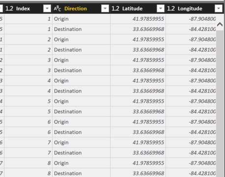
| index | Direction | Latitude | Longitude |
| 1 | Origin | 41.97 | -87.9 |
| 1 | Destination | 33.63 | -84.42 |
| 2 | Origin | 41.73 | -71.43 |
| 2 | Destination | 33.63 | -84.42 |
| 3 | Origin | 35.21 | -80.94 |
| 3 | Destination | 33.63 | -84.42 |
We will include other columns, however the format of alternating rows for the origination of the route and then the destination with the latitude and longitude for each is required. Having an Index row that keeps the right origin and destination values ordered appropriately will also help Power BI from making adjustments that you don’t want.
The Double Merge
Latitude and Longitude are not included in the flight data so we need to do a MERGE from the airport data set that we have.
NOTE: Finding lat/long values for zip codes, airport codes, city names, etc… is generally the hardest part of using ggmap and is why most of the time the use of a second reference data set is required to get this data
Perform a “Merge Queries” against the “origin” column of the flights data and the “Code” column (this is the 3 letter airport code from the airports data set)
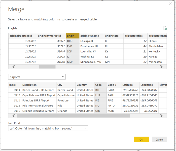
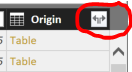
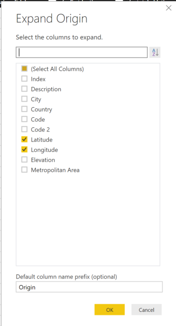
Rename the newly created column as “Origin” and then click the “Expand” button to select the Latitude and Longitude columns ONLY to be merged.
Now repeat the above Merge steps a second time but instead of using the “origin” use the “dest” column from the flights data and merge against the same 3 digit code in the airports data. Call the new column “Dest” before expanding the Latitude and Longitude.
Once finished your dataset should look like this:

We have successfully acquired latitude and longitude which ggmap needs to plot the path of the line. However, we need the values of Lat/Long for origin and destination to be on separate rows as shown above. This is where we get to use my favorite M/PowerQuery function of “Unpivot”
Using Unpivot
To ensure later that the order of our rows are not out of sync when creating the dataframe for the R visual, add an index column via the “Index Column” button on the “Add Column” tab. I start at 1.
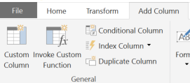
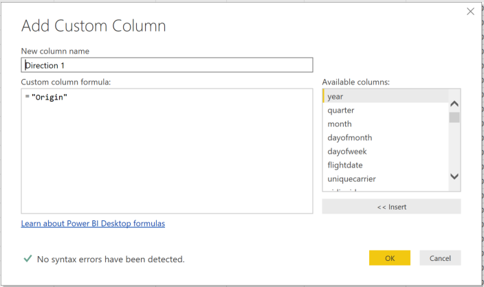
We need to have two columns to unpivot on to create two rows for each single row currently in the data set. I achieve this most simply by adding two custom columns via the “Custom Column” button on the “Add Column” tab. Just fill in the expression with the string “Origin” and then “Destination” for each new column as shown below
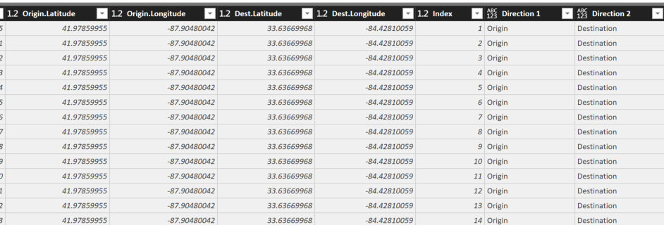
The data should now look like this:
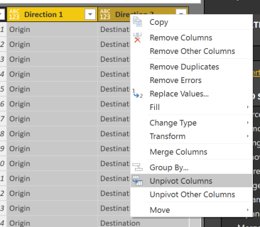
Select both of the new custom columns (mine are called Direction 1 and Direction 2) right click and select “Unpivot Columns”
Now each row has been duplicated so that we can get the Origin and Destination latitude and longitude on separate rows.
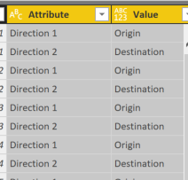
The newly created “Attribute” column should be removed and in my example I have renamed “Value” to “Direction”.
NOTE: In this example I am using unpivot to manipulate my single row into two rows. A more meaningful use of unpivot would be if you have revenue data by month and each month is represented as a column (Jan, Feb, March, etc…) you could select all the month columns and “Unpivot” and you would now have a row for each month as the attribute and the sales amount as the value.
Conditional Columns
Once the unpivot has been completed, add two conditional columns for “Latitude” and “Longitude” via the “Conditional Column” button in the “Add Column” tab to get the values for Origin and Destination into a single column for each. Use the “Direction” column as the conditional and when it equals “Origin” select the “Origin.Latitude” column. Otherwise, select the “Dest.Latitude” column.
See below example for Latitude:

Be sure to change the type of the two circled buttons from Value to Column.
Repeat the above for Longitude.
Change the type of these new columns to decimal numbers.
Now remove the 4 columns of “Origin.Latitude”, “Origin.Longitude”, “Dest.Latitude”, “Dest.Longitude”.
The last 4 columns of the Flights data set should now look like this:
Data prep is complete. We can now close and Apply.

The data load will take a long time if you used the 2.4 GB file from Enigma.IO… Time for coffee 🙂
Creating the Viz
As we work with this data set, remember that we now have two rows representing each flight. So if you want to get any counts or summarizations, always divide by 2 in your measures.
Number of Flights = COUNTROWS(Flights) / 2
Number of Delayed Flights = sum(Flights[depdel15]) / 2
Number of Cancelled Flights = sum(Flights[cancelled]) / 2
With these 3 measures, we can start working on visualizations. First, simply a few card visuals and a matrix by origin/destination
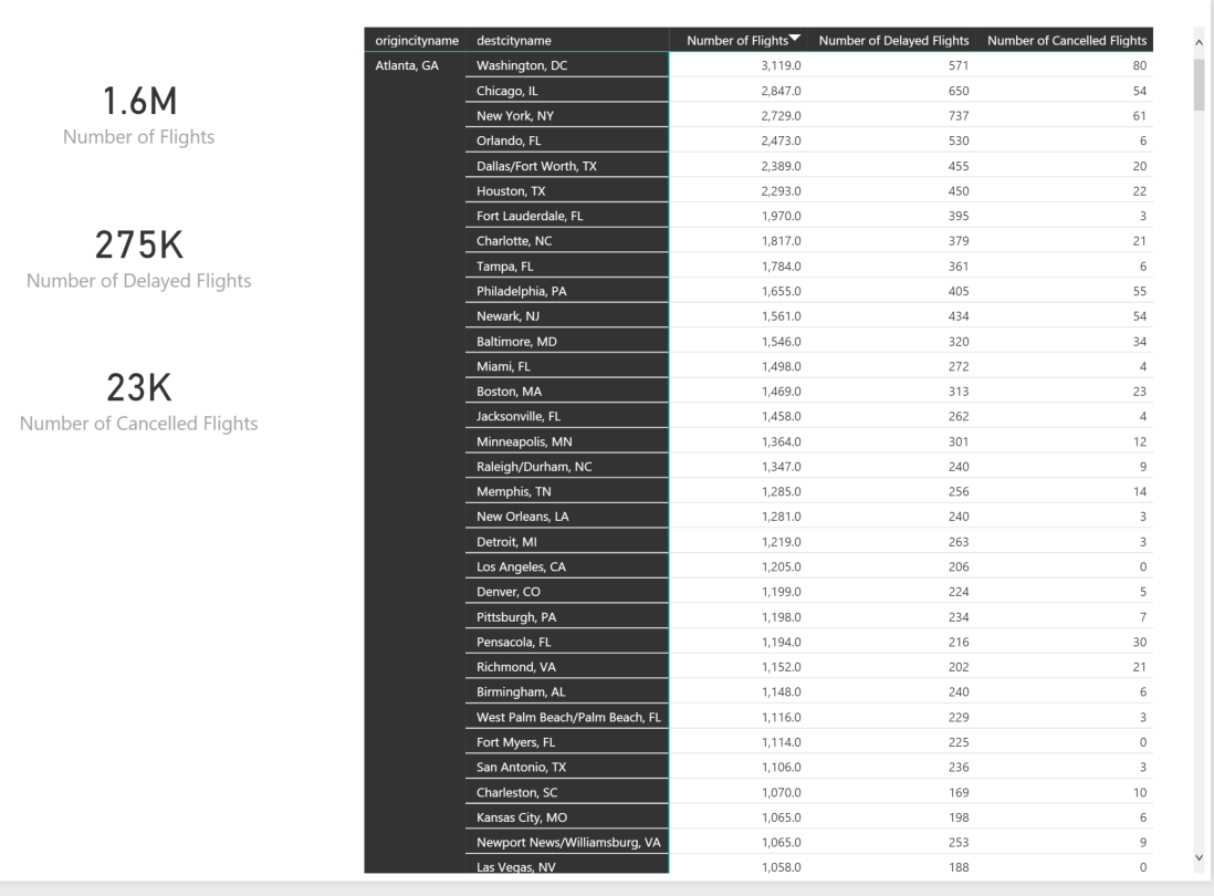
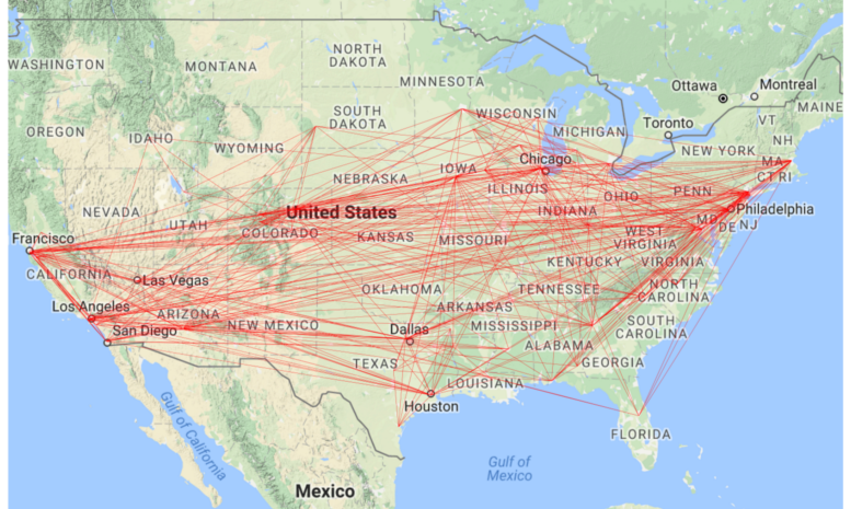
We have 1.6 million flights in our data set. Creating an R visual to represent all of these routes will not be very productive and will probably crash your memory anyway. Let’s setup a filter by origincityname and only route the cancelled flights.

For the above visual, we first should add origincityname as a slicer and select “Atlanta, GA”. Then add a slicer for cancelled = 1.
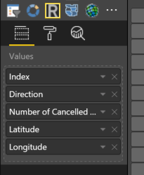
To create the R visual, select the “R” visualizations icon
![]()
Pull in the following values from the “Flights” data
This automatically generates some R code in the R script editor for the Visual
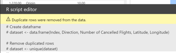
NOTE: This is really important as we have eliminated potentially 100s of lines of R code to “prep” the data to make the data frame look like we need it to be entered into the ggmap function. This was all done via the Query Editor transformations we made above.
Now we simply add the 2 lines of R code underneath the generated R script section
# This function simply imports the required library (ggmap)
# to be used in the Power BI R visual
library(ggmap)

# qmap is a wrapper for ggmap and get_map.
# The first parameter is the locale that you want to be mapped. second is zoom level.
# Then geom_path is used to give the details of what data is to be plotted.
qmap("united states", zoom = 4) + geom_path(aes(x = Longitude, y = Latitude), size = .1, data = dataset, colour="red", lineend = "round")
NOTE: The comments make it longer than two lines, but helps describe what is happening
The geom_path function is part of the ggplot2 library and is further explained here: http://docs.ggplot2.org/current/geom_path.html
Hopefully from this example you can see that the R code is fairly minimal in filling the requirement of routing visualization.
Measures vs Columns for this R Visual
One limitation that currently exists in Power BI Desktop is that the measures we defined earlier are not really providing value to the visualization because we need to include the “Index” column to keep the dataset ordered as expected for ggmap to plot the route from the alternating rows of data.
Because the index column is required to keep the sort order, the filter context applied to the DAX measure of “Number of Cancelled Flights” will always equal 1. This does not allow us to do much “Business Intelligence” of the data set.
EARLIER function
Until this day, I am still not fully aware of why they call this function EARLIER, but what we need to do to introduce some actual “Business Intelligence” into this R visual is to create a column with the total number of cancelled flights via a given route. This “column’s data” will be repeated over and over so beware of how you utilize it. However, it will give us a great way to ONLY retrieve the data that we want.
For the “Flights” data set, add the following column to create a unique value for each Route that exists between airports:
Unique Route ID = CONCATENATE(Flights[originairportid],Flights[destairportid])
Once that value is added, the EARLIER function can be applied to get the total number of cancellations:
Total Cancelled for Route = SUMX(FILTER('Flights',EARLIER('Flights'[Unique Route ID])='Flights'[Unique Route ID]),'Flights'[cancelled])/2
The above value is repeated in every row, so don’t use it to be summarized… use it as a page level filter or a slicer to only retrieve data that meets that requirement (example: Only show routes that have more than 25 cancellations)

Make sure your slicers are cleared and your new plot should look something like this:
Now the solution is starting to become usable to gain some insights into the data. You can download my finished solution from the github repository and see that I have duplicated the “Airports” data set and have one for Origin and one for Destination that I can use as a slicer to more quickly find routes that have frequent cancellations from/to each city or state.
Conclusion
This is just an example of the many ways Power BI can be extended to help solve business problems through visualizations. One note to make is that ggmap is not yet supported by PowerBI.com. This specific R visual is only available in the desktop but many other R visuals are supported in the service as well.
And for my next article, we will see if i am brave enough to post my real opinions on the internet about Big Data and data warehousing architectures. I have lots to “rant” about but we will see if I actually post anything 🙂

An outstanding share! I have just forwarded this onto a colleague who was doing a little research on this.
And he actually ordered me lunch because I found
it for him… lol. So allow me to reword this….
Thanks for the meal!! But yeah, thanks for spending time to discuss
this subject here on your web site.
LikeLike
Looking forward to reading your rant on Big Data and Data Warehouse.
LikeLike
This is awesome, thanks!
LikeLike
This is awesome! I always love to see people using data from Enigma in a creative fashion. Just a heads up – we’ve actually moved from enigma.io to Enigma Public. You can check out the new site here: https://public.enigma.com/ It would be much appreciated if you could change the reference here: The data load will take a long time if you used the 2.4 GB file from Enigma.IO… Time for coffee.
Hope it was a good cup of joe ;).
LikeLike
Thanks for the post. I am just getting started with Power BI and I am looking to visualize two sets of lat/long values. First set is actual lat/long and second set is expected lat/long. Any ideas on how I do that?
LikeLike
you may want to try the flow map visual …. https://weiweicui.github.io/PowerBI-Flowmap/
LikeLike