The Power BI bubble map is very useful when plotting geography points rather than shapes or areas. I’d say that in 90% of the cases in how you should be representing your data the out of the box functionality should be fine. Occasionally however you will run into scenarios that you must plot more than a few thousand data points in which you will exceed the upper bound and get the little information icon shown below.


What is frustrating about this when it comes to maps is that it does not take a representative sample of the data and instead will just “cut off” the data points. Other visualizations will show an information icon with this message instead:

There are 3 techniques that I have used to deal with this issue.
- Creating a representative sample via DAX
- Using R script with ggmap
- Using a location hierarchy
All of these have pros and cons.
Getting a Representative Sample via DAX
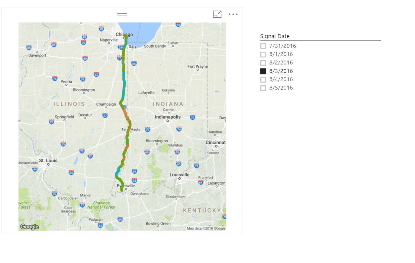
The best way to illustrate the native map behavior and how we solve for it is by using an embedded Power BI report. I am going to use some anonymized data from a logistics company that represents cell phone signal strength across one of their routes. The route in this example starts in the Chicago, IL area (United States). See the first tab in the report below.
Note: Use the “full screen” button in the lower right to expand
In the 4 visuals above, notice that the 1st and 3rd only plot a tiny portion of the latitude/longitude. This is confirmed as if you hover over the highest point the latitude is much less than the max latitude shown in the multi-line card visual in the upper right. You can also just “zoom out” on these and see that no points are plotted anywhere near Chicago which is where this route starts.
I included the 2nd visual as I did find it interesting that when I used a value in the SIZE field that may be greater than 1, it seemed to plot more evenly across the entire span of the latitude, however I still would not consider this “representative”.
The 4th visual is simply a scatter plot of the latitude/longitude. Note when hovering over the “I” icon in the upper left it states that it is a representative sample. This is what we want to achieve in the bubble map that is not done natively. In this scenario where we have a continuous latitude/longitude plot, this is a good solution.
Now navigate to the second page of the report. Here you will find the map visual always giving the representative sample regardless of how many dates you select in the slicer. I have solved the real business problem here by adding the cellphone signal strength as the legend across the route.
Compare the min and max latitudes in the card visual with hovering over the highest and lowest plotted point on the map. You should notice them to be consistent and the points in between are filled nicely.
“If there is an easier way to do this than what i am about to show, please share with me”
I worked through several iterations before arriving at the conclusion that using RAND() ( or RANDBETWEEN() actually ) was the magic I needed. This is the random number generator expression for those of you that don’t know. And for those of you that do know, you are probably questioning my knowledge a little bit at this point 🙂 but this was truly the only way i got this to work without having to make too many assumptions about the data.
Let’s get into the DAX.
It is important to know how you plan to slice the data in your map visual. In my case, i want to be able to select a date or range of dates to review the cellphone signal strength and how it may vary over time. We can simply get the count of rows in the table with a formula like this:
Total Signals (WRONG) = countrows('Carrier Signal Strength')
I have appended “WRONG” to the measure name because we run into an issue of CONTEXT on the map and we have to do a context transition (as described by Alberto Ferrari here). In the correct formula below, we need to include ALL rows of the table, except for the rows we are filtering out with the date slicer.
Total Signals (RIGHT) = CALCULATE(countrows('Carrier Signal Strength'),
	ALLEXCEPT('Carrier Signal Strength','Carrier Signal Strength'[Signal Date]))
Notice on the second page of my embedded report above, i have listed a couple of the measures in my card visual that are the wrong ones. Apply a date filter and then in the map select a single point. Notice how the “Total Signals (WRONG)” changes to 1. This is because you have just applied filter context to the measure when you selected that single point on the map. We have to use this measure in getting a representative sample but it has to ignore the map’s filter context which is why in the RIGHT measure above, we have done the context transition to get ALL of the rows except for those being filtered by the date.
Now we need to apply a sample rate to the selected rows. The sample rate will be dynamic depending on how many rows are selected. We start to exceed the bounds of the map visual at around 3000 points so i play it safe below and use 2500 as my denominator. This is because the later calculation will not exactly match this and we may end up with more than 2500 rows.
Sample Rate (RIGHT) = CEILING(DIVIDE([Total Signals (RIGHT)],2500),1)
The CEILING function just rounds whatever the decimal number is up to the nearest integer as i have specified “1” as the second argument.
On page 2 in the report above, you can see how the sample rate changes as the total signals increases with multiple dates selected in the slicer
As the next building block in the representative sample formula, we will pull out the random number generator to give a random number between 1 and the dynamic sample rate that was calculated above
Rand (RIGHT) = RANDBETWEEN(1,[Sample Rate (RIGHT)])
We will use the number generated from this measure and compare it to our Sample Rate. When they are equal we will plot the point.

Before you call me crazy and question my judgement… yes, i know that RAND or RANDBETWEEN does not guarantee me a consistent sampling of data. If my sample rate is 100, it may take me 150 or even 200 tries before my measure above equals the sample rate. But it also may only take 5 tries to equal it as well. I look at the use of RAND() as a “better than the alternative” approach as it gives me the opportunity to get a representative sample of my data versus getting a cut off and unusable data set.
In a prior attempt, i used the MOD function and some other DAX acrobats to try to ensure a consistent representation of the data, but in each attempt i was defeated by the filter context issue of the lat/long on the map. This is where I would humbly welcome feedback from any DAX ninjas if there is a better way.
The reason that using the RANDBETWEEN() function works is that it re-evaluates for every single point on the map trying to be plotted.
Below is the measure for the representative sample. Use this in the SIZE field.
Representative Sample (RIGHT) =
if([Rand (RIGHT)]=[Sample Rate (RIGHT)],
	[Total Signals (RIGHT)],
	BLANK())
As it is possible i could have multiple rows being counted for the same lat/long position, i add some additional DAX to ensure i only have a size of 1 or BLANK()
Representative Sample (RIGHT) =
var plot = if([Total Signals (RIGHT)]>=1,1,BLANK())
RETURN if([Rand (RIGHT)]=[Sample Rate (RIGHT)],plot,BLANK())
The result below is a nice smooth representative sample without too much DAX needing to be written.

Pros for using this approach:
- Easy… low difficulty level
- Native Bing map means it is zoom-able… in my use case, it is important to be able to zoom in on the areas that have bad signal coverage
- Great for big datasets… I believe all the DAX used above is available when doing direct query
Cons
- Using RAND does not ensure a consistent sampling
- May not be well suited for geographically disperse data (see the hierarchical approach below)
Using R script with ggmap
Another way to approach the sampling problem is with an R visual. We can create an R Visual that uses ggmap to plot the data points for our route.
I drag in the LATITUDE, LONGITUDE, Max_Signal_Rate, and the Total Signals measure (to avoid pre-sampling the data, reset this measure to just use the COUNTROWS function)
Total Signals = countrows('Carrier Signal Strength')
Here is the R script that then needs to be put in the R Script Editor
#Pull in the ggmap library
library(ggmap)

#Specify the google map area to use with a zoom factor.
#Unfortunately this will create a static map that is not zoom-able
#I have selected "Paris, il" as it appears to be near the center of my route.
#You can test the text to use for the location attribute by going to https://www.google.com/maps
Illinois<- get_map(location = 'paris, il', zoom = 7)

#Use a sample if your dataset starts to get too large.
#The R visual in Power BI can accept more than 3000 data points but there still appears to be an upper bound
#I have not found what that limit is yet
datasample <- dataset[sample(nrow(dataset), 5000), ]

#Create a theme variable to remove the X and Y access as well as the legend from the map plot
theme <- theme(axis.title.y = element_blank(), axis.title.x = element_blank(), legend.title= element_blank(),
legend.key = element_blank(), legend.position = "none")

#Perform the plot with ggmap by using our map of Illinois and adding the geom_point plot behavior
#    as well as the theme we just defined
#Replace "data = dataset" with "data = datasample" if you determine a sample needs to be used
ggmap(Illinois, extent = "device") + geom_point(aes(x = LONGITUDE, y = LATITUDE, color=Max_Strength_Rate),
    alpha = 0.1, size = 2, data = dataset) + theme
To use the above code, you will need to be sure you have installed R on your machine and that you have also installed the ggmap and ggplot2 packages.
The above code will produce a plot shown below and can still be filtered with a date slicer.
As i am still learning R, i didn’t take the time to assign a specific coloring scheme for the plotted points so the above just took the default.
There are a couple of obvious CONS to this approach
- You have to know R. It is not nearly as easy as just using native Power BI visuals and a little bit of DAX
- The map is not zoom-able. It is completely static which does not allow me to achieve solving my business problem which is to zoom in on the spots that my signal strength is low. For my use case, this does not work, however in another use case, the zoom may not be an issue.
A couple of PROS for this approach
- I can plot more data points with ggmap. It appears there is still a data limit but it is larger than the out of box map. I have not yet determined what that limit is. I believe it is more to do with Power BI R visuals however and not with the R ggmap functionality.
- With the ability to “code your own visual”, there is much more control and opportunities to create a custom experience. instead of using the geom_point function we could use geom_tile to see a more “blocky” heat map style plot as shown in this tutorial or even using geom_path which would allow you to do more of a point A to point B type of map if you didn’t really need to plot information along the way as shown in my example.
Using a Location Hierarchy
This to me seems like an obvious approach when dealing with location data that has a natural hierarchy such as Country->State/Province or Country->City.
So instead of having something like this
by using a hierarchy in the “Location” field you can right click and “drill down” on a parent geography to see the details
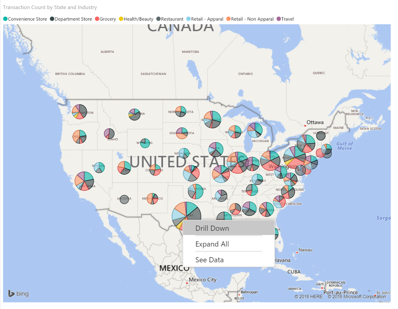

This is a very clean way to keep your data points under the threshold of around 3000 without having to write any DAX or R. The biggest problem with this however is it is fully dependent on the location hierarchy giving the necessary split to keep the lowest level of detail going over the threshold.
These are 3 different ways of dealing with too much data trying to be plotted on your maps. Again, for the representative sample pattern i showed i am interested in any thoughts of better approaches. Leave them in the comments or ping me on Twitter at @angryanalytics.

Have you tried using the DAX Sample() function? https://msdn.microsoft.com/en-us/library/dn306781(v=sql.110).aspx
I haven’t tried it myself, but it looks like it should be useful here.
LikeLike
yes… i can never get the thing to work.. it is one of the many iterations i tried before RAND().. good suggestion though… but i could never get SAMPLE() to actually sample anything…
LikeLike