Working with Scatter Plots in Power BI

I really like some of the advancements that have been made in Power BI scatter plots over the last few months. I wanted to point out some capabilities you may not be using that maybe you should be.

Data Sampling Improvements

In the September 2017 release, you can now be confident that all of your outliers are being shown. No one can visually look at a plot and interpret several thousand data points at once, but you can interpret which of those points may be outliers. I decided to test this out myself between a Python scatter plot of 50k data points and Power BI.

In the test, I used a randomly generated normal distribution of 50k data points to ensure I had some outliers.

#Create a random dataset that has a normal distribution and then sort it (in this case, 50000 data points)
x = np.random.normal(50,25,50000)
x = np.sort(x)

#Create another dataset to put on the y axis of the scatter plot
y = np.random.normal(50,25,50000)

#plot the dataset
plt.scatter(x,y,alpha=0.3)
plt.show()

(You can see the Python notebook on my GitHub here).

Here it is in Python:

Here it is in Power BI (September desktop release)

Notice that all the outliers have been preserved. Note that in previous releases, the Power BI rendering of this would have been shown as below.

This is a great improvement. To learn more about this update, check out the official blog post on high density sampling: https://powerbi.microsoft.com/en-us/documentation/powerbi-desktop-high-density-scatter-charts/

Working with Outliers (Grouping)

Now that we know the dense sampling is preserving our outliers, we can perform some analysis on them. Power BI makes it easy to CTRL+click on multiple outliers and then right-click and add new Group

This will create a new field in your fields list for this group of outliers and will automatically include a Group for “Other” (the other 49.993 data points that weren’t selected). Note that I renamed my field to “High Performers”

As this is a random dataset with integers for x,y values there are no dimensions here that may be interesting to compare, but consider now we can always come back to this grouping for further analysis such as the bar chart below:

Clustering

You can also use “…” in the upper right of the scatter chart to automatically detect clusters. Our example again is a bit uninteresting due to it being a random normal distribution but gives you an idea of how you can cluster data that is more meaningful.

Symmetry Shading and Ratio Lines

These gems were released in the August 2017 desktop release and really helps visualize the skew of your data.

Both of these can be turned on from the analytics tab.

Instead of using our sample dataset above I will use the dataset from my last blog post on Scorecards and Heatmaps.

In the below plot I took the SalesAmount field and plotted on the y axis against the SalesAmountQuota field on the x axis. From Symmetry shading we can observe that none of our sales people are meeting their quota. From the ratio line we can see the few individuals that have a positive variance to the ratio while most are flat or below the ratio.

You can read more about these two features in the August Desktop blog post: https://powerbi.microsoft.com/en-us/blog/power-bi-desktop-august-2017-feature-summary/#symmetryShading

Conclusion

These are just a few of the recently released features that I think have made the native scatter chart in Power BI a very useful visual. I have posted the PBIX file for the normal distribution data on my GitHub if you would like to download: https://github.com/realAngryAnalytics/angryanalyticsblog/tree/master/20171002-scatterplots


Performance Scorecards and Heatmaps

The new Matrix visual in Power BI is impressive and with a few tricks you can make great interactive scorecards and heat maps. At first glance, you may assume this to be easy, but you will see in the below content you have to make some deliberate decisions with formatting and also create several measures to get the job done.

I have the finalized PBIX file on my GitHub repository so use that for reference as we walk through building these visuals.

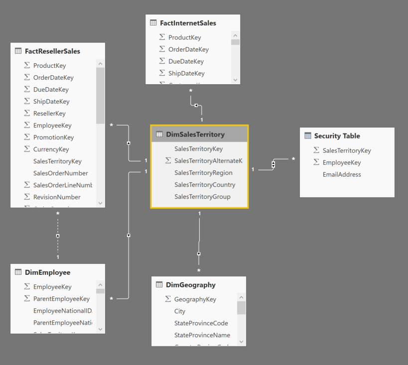
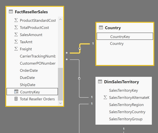
I am using the AdventureWorksDW dataset for this. I have imported the FactResellerSales table and selected the related tables. The main tables used will be FactResellerSales, DimEmployee, DimSalesTerritory, FactSalesQuota

I have created 5 base measures to be used for our scorecard. Note that I have manufactured the Customer Complaints value by using RAND. The required measures are below:

//add this as a calculated column in FactResellerSales table
Customer Complaint Indicator = IF(ROUND(RANDBETWEEN(0,1000),0)=999,1,0)

//add these measures to the FactResellerSales table
Sum of Sales Amount = sum(FactResellerSales[SalesAmount])

Total Orders = DISTINCTCOUNT(FactResellerSales[SalesOrderNumber])

Discount Percentage = IFERROR(sum(FactResellerSales[DiscountAmount]) / sum(FactResellerSales[SalesAmount]),blank())

Sum of Customer Complaints = sum(FactResellerSales[Customer Complaint Indicator])

Quota Variance = ([Sum of Sales Amount] - sum(FactSalesQuota[SalesAmountQuota]) ) / sum(FactSalesQuota[SalesAmountQuota])

Also, one more change to make things more readable. In this data set in DimEmployee do a rename on the EmergencyContactName to Full Name. I noticed that this was the concatenated value of First Name and Last Name… or you could create a calculated column if you wish.

To create a scorecard as I have shown above, we need to use the “Selected Measure” trick where we will create a Measure table and use a DAX expression to populate the appropriate measure value depending on which value is selected in the table.

You can use the “Enter Data” button in the ribbon to simply enter the 5 values (and optionally an order) as shown below

Now with the Metrics table and the measures you have added above, you can create the below measure to switch between them based on a slicer or filter that has been applied

Selected Measure = IF(
    ISFILTERED(Metrics[Value]),
    SWITCH(
        FIRSTNONBLANK(Metrics[Value],1=1),
        "Sales Amount",sum(FactResellerSales[SalesAmount]),
        "Total Orders",[Total Orders],
        "Discount Percentage",[Discount Percentage],
        "Customer Complaints",sum(FactResellerSales[Customer Complaint Indicator]),
        "Quota Variance",[Quota Variance]),
    BLANK())

This snippet shows a SWITCH statement used against the FIRSTNONBLANK value only if the Metrics table ISFILTERED

You can try this out by creating a simple bar chart visual using the Selected Measure as the value and the DimEmployee[Full Name] (that we created earlier) as the X Axis. Also add the Metrics[Value] as a slicer

This simple trick allows us to get a row for each measure on our scorecard later.

Lots of Measures

The next part is tedious. Each of our 5 measures above actually requires 5 additional measures to get the attributes found in the scorecard. This means 30 total measures to show 5 rows in our scorecard.

The opportunity here however is if you are not a DAX expert, this may be a good primer for you to understand how DAX really makes almost anything possible in PowerBI. I will show the formulas for “Sales Amount” and a few nuances for other metrics after that. For all the details, refer to my GitHub repository with the PBIX file.

For our scorecard, we want to be able to show a percentile and a quartile value. This makes it easy at a glance to see how an individual (or sales region) is doing in respect to their peers. To get either of these values, we must first calculate the RANK of the sales person.

We will use RANKX to calculate the RANK of the sales person for [Sum of Sales Amount]

Sales Amount Rank =
    RANKX(
        ALL(DimEmployee),
        [Sum of Sales Amount])

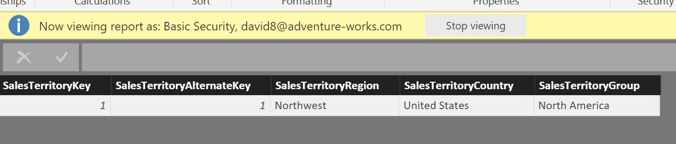
Note the use of the ALL function over DimEmployees. Because FILTER Context is applied in a table or matrix visual, when a row is shown for employee “Amy Alberts”, because of relationships in the data model, the only rows from the FactResellerSales table that are being evaluated for a measure are the ones for Amy Alberts’ employeeKey. We need to use ALL to ensure that filter context is cleared when evaluating the RANKX expression. See the below table as an illustration.

There is one more problem with our DAX however… DimEmployee has over 200 employees and not all of them are in Sales. The above DAX will calculate a rank for ALL employees instead of JUST the sales employees. One method to reduce this is to simply set this column to BLANK() if the [Sum of Sales Amount] measure is blank. The final DAX used is below. (I used a variable for readability but not necessary)

Sales Amount Rank =
var rnk = RANKX(
        ALL(DimEmployee),
        [Sum of Sales Amount])
RETURN IF(ISBLANK([Sum of Sales Amount]),BLANK(),rnk)

NOTE: simply using sum(FactResellerSales[SalesAmount]) will not work here, this is why we created a measure for it

With a Rank value, now we can calculate the “percentile” the sales person is in. This is effectively “normalizing” the ranks.

Sales Amount Percentile =
var a = countrows(
            FILTER(ALL(DimEmployee),DimEmployee[DepartmentName]="Sales"))
var b = [Sales Amount Rank]
return IF(b=0,BLANK(),IFERROR(ROUND((a-b)/a,2),blank()))

To determine the denominator, we are using a FILTER to only retrieve the employees that are in the “Sales” department.

Now with the percentile, we can determine the quartile the sales person is in.

Sales Amount Quartile = 
IF(ISBLANK([Sales Amount Percentile]),BLANK(),
    IF([Sales Amount Percentile]>=.75,1,
        IF(FactResellerSales[Sales Amount Percentile]>=.5,2,
            IF([Sales Amount Percentile]>=.25,3,
                4))))

I have used the ISBLANK() function to ensure I do not get any unwanted values showing up in Quartile 4. (Note: I had an Excel savvy client tell me I could use MOD() for this but I couldn’t get it to work, so this may be more verbose than it has to be)

Lastly, lets get the average Sales Amount for the company as a comparison for the score card.

Sales Amount Avg = CALCULATE(
              AVERAGEX(DimEmployee,[Sum of Sales Amount]),
              FILTER(ALL(DimEmployee),DimEmployee[DepartmentName]="Sales"))

CALCULATE applies the second argument’s FILTERed table to the first argument’s expression. AVERAGEX will get the average value of [Sum of Sales Amount] by the DimEmployee record

Now apply the same logic to the other 4 metrics we want to put on our scorecard. A few things to note are explained below.

When using RANK, some of the metrics such as Discount Percentage (as we don’t want to give big discounts to make sales) and Customer Complaints need to be ranked in ascending order instead of the default of descending order. So in those instances, we need to add an additional parameter to the RANKX function.

Customer Complaint Rank =
var rnk = RANKX(
              FILTER(ALL(DimEmployee),
                  NOT(ISBLANK([Sum of Customer Complaints]))),
              [Sum of Customer Complaints],,ASC)
RETURN IF(ISBLANK([Sum of Sales Amount]),BLANK(),rnk)

We have added “ASC” as the 4th argument to RANKX for “Ascending” order. Notice the missing 3rd argument. This is to tell the rank function if you want DENSE ranking. We want the default which means if 3 values are tied for the 10th ranking, the next rank will show 13 instead of 11.

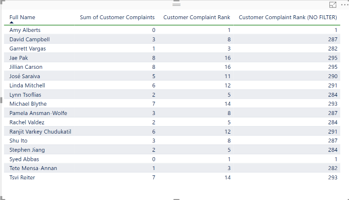
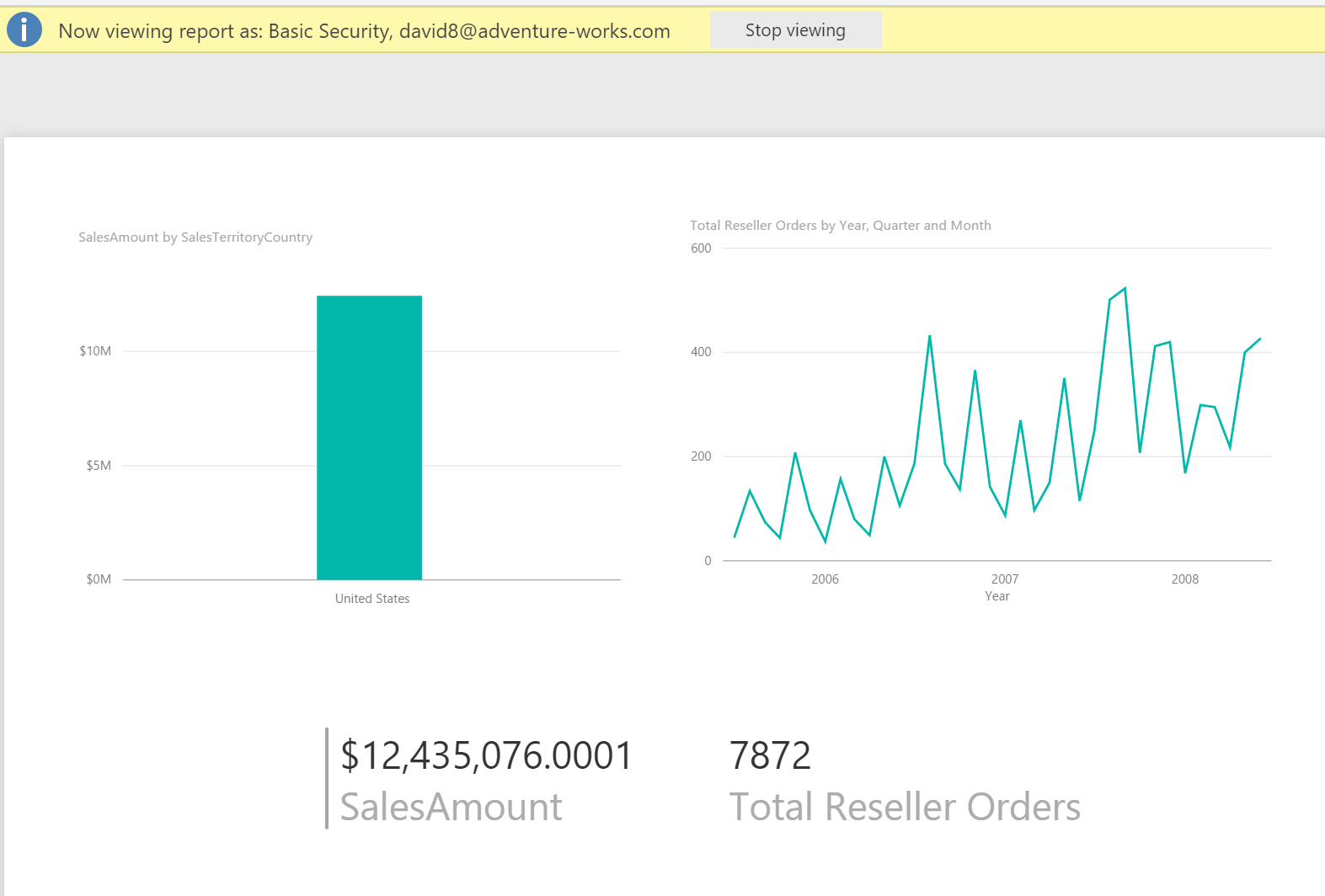
Also, in the above measure, we have added a FILTER to the ALL(DimEmployee). See the below screenshot to see the RANK without this filter:

When the FILTER expression appears, we are further reducing the table in the first argument. Here, we are checking for [Sum of Customer Complaints], if it ISBLANK(), then applying a NOT to that. So, if [Sum of Customer Complaints] is not blank, we want to include those rows in the ranking. This is necessary to add when doing an ASCENDING rank as employees in the employee table that have no sales records are still getting ranked. This is true also when in DESCENDING order but it doesn’t matter because those rankings are below the sales people and because we have applied the ISBLANK([Sum of Sales Amount]) after the rank has occurred, they are filtered out anyway.

Just as was done with the Selected Measure before, each of these additional measures that may be displayed such as “Quartile” and “Percentile” need to have the ISFILTERED condition applied to the Metrics table:

Selected Percentile = IF(
    ISFILTERED(Metrics[Value]),
        SWITCH(
            FIRSTNONBLANK(Metrics[Value],1=1),
            "Sales Amount",[Sales Amount Percentile],
            "Total Orders",[Total Orders Percentile],
            "Discount Percentage",[Discount Percentage Percentile],
            "Customer Complaints",[Customer Complaints Percentile],
            "Quota Variance",[Quota Variance Percentile],
            BLANK()))

Repeat this with Quartile and Avg measures.

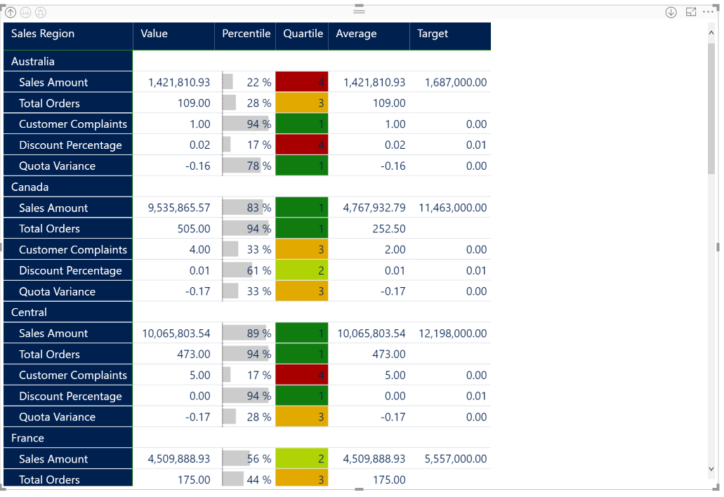
Formatting the Scorecard

Create a new matrix visual

Now select the Metrics[Value] as Rows and your Selected Measure measures as values.

On the screenshot above you will notice that I added an additional measure Selected Measure Target . This follows the same pattern as shown above with the SWITCH statement and uses the sum of FactSalesQuota[SalesAmountQuota] as well as the 3 static values for Customer Complaints Target, Discount Percentage Target, and Quota Variance Target. I left Total Orders as BLANK(). The final measures are shown below.

Customer Complaints Target = 0

Discount Percent Target = .01

Quota Variance Target = 0

Selected Measure Target = IF(
    ISFILTERED(Metrics[Value]),
        SWITCH(
            FIRSTNONBLANK(Metrics[Value],1=1),
            "Sales Amount",sum(FactSalesQuota[SalesAmountQuota]),
            "Total Orders",BLANK(),
            "Discount Percentage",[Discount Percent Target],
            "Customer Complaints",[Customer Complaints Target],
            "Quota Variance",[Quota Variance Target],
            BLANK()))

Apply a matrix style from the formatting menu in the visuals pane. I chose Bold header.

I also increase the “Text Size” property in the Column Headers, Row Headers, and Values all to 11.

With the July 2017 release of Power BI Desktop, you can now simply right click any of the values in the selected fields and rename them. This allows us to rename our row and column headers.

Now we have this

Right click on the Percentile in the selected fields pane and select conditional formatting -> data bars

In the below dialog, notice that I have changed the Minimum/Maximum to Number values 0 and 1. This is to keep the data bars from being “relative” to what is shown and will show the full span from 0-100%. Also have changed the Positive bar color to a gray so that the bar is not distracting, but rather accents the percentile.

Now right click the Quartile and select conditional formatting -> color scales

See the selections in the above screen shot.

Format blank values – I select “Don’t Format” as when a value is blank, don’t give the impression that it is actually good or bad

Minimum and Maximum – I change these values from Lowest and Highest value to a Number. This is because you want every representation of quartile 1,2,3,4 to be the exact same color. If you leave this as default, sometimes 2 will be completely red and sometimes it will be completely green

Diverging – This gives us a center color that helps make the 2nd quartile look light green and 3rd quartile be orange.

The hex values I use for these colors are 107C10, FFFE00, A80000 respectively

Now the scorecard is complete. Add a slicer for Employee[Full Name] and you can see how each of your sales people are doing

Insight taken from the above screenshot that “Linda Mitchell” is one of our best sales people but it may come at the expense of customer complaints and giving deeper discounts than others.

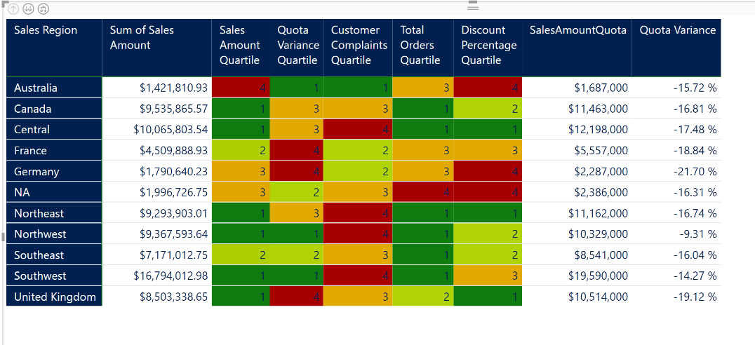
Creating the Heatmap Visual

Now we can take the skills acquired from the scorecard to create a heatmap.

Simply use a matrix visual again and set the rows to DimEmployee[Full Name] and select each individual measure you want to display as a value. Try to put all the quartiles together so there is a good heatmap effect. Include additional measures that may be valuable to sort by. Remember, the matrix visual has automatic sorting by column so this may help with analysis. I have selected the below values.

With re-applying the Quartile conditional formatting logic from above, the heatmap should looks something like this.

If you have a bunch of additional employees showing, add the DimEmployee[DepartmentName] as a visual or page level filter and that will reduce your rows.

Using a Region Hierarchy

IF you are still here (most of you have already thought TL;DR by now)… we can real quick add a calculated column in the DimEmployee table for “Sales Region” so that we can create a heatmap that roles up to the sales region.

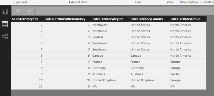
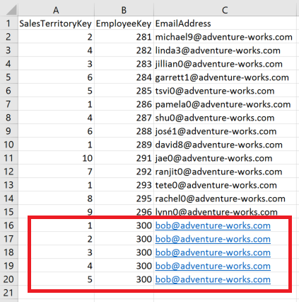
Sales Region = LOOKUPVALUE(DimSalesTerritory[SalesTerritoryRegion],
                   DimSalesTerritory[SalesTerritoryKey],
                   DimEmployee[SalesTerritoryKey])

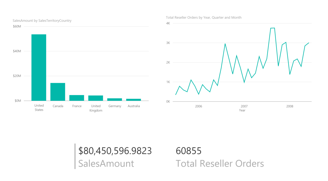
Simply add the DimEmployee[Sales Region] to your Rows above your DimEmployee[Full Name]. Now you have a heatmap that can rollup to the sales region level. See below.

On the scorecard you now can see comparisons of your regions as well.

Conclusion

There are many variations of scorecards and heatmaps. I have found the above use of the new Matrix visual to be very good.


Deep Learning Toolkit considerations for emerging data scientists

Overview

Disclaimer: This blog is my own opinion and not that of my employer, however it should be noted that I am a Microsoft employee and this may reflect that perspective.

Update: New version of these benchmarks is being worked on and can be tracked here: http://dlbench.comp.hkbu.edu.hk/

This post is a departure from my usual focus on Power BI. Enterprise deployment scenarios for Power BI have been a great subject for me. However, In my day job, I do work on a variety of data platform related subjects. These are my findings on deep learning toolkits and what you should know before getting too deep into them, especially pay attention to my section on Keras

Deep learning is popular for image processing (computer vision, facial recognition, emotion detection), natural language processing (sentiment analysis, translation), and even starting to find its way into areas such as customer churn. Neural networks with many layers are used to increase precision of a prediction as opposed to more statistical type algorithms such as linear regression.

There are several popular open source deep learning toolkits including Caffe, Torch, TensorFlow, CNTK (now Cognitive toolkit), and mxnet

This post will mostly reference TensorFlow and CNTK for reasons established in the section on Keras.

Python vs R

This debate will rage on for probably another decade similar to how I remember the Java vs C# debate as a developer in the early 2000’s. From what I have seen, Python appears to have more support in the area of deep learning than R. All but Torch support Python integration while only TensorFlow and mxnet support R directly.

Toolkit Performance

One of the most important aspects of a deep learning toolkit is performance.

Lets consider a couple of scenarios:

In the software development cycle a poorly indexed table could be the difference in 5 seconds and 5 minutes to call the database. This is annoying but is not the critical path to meeting a deadline. It takes many developer hours and iterations to build the code around that database call making that index issue less significant, but of course something that should be addressed.

In deep learning on the other hand, the difference between a model that performs twice as fast as another toolkit could mean the difference between 1 vs 2 days of training time. The iteration cycle is greatly impacted and retraining a model 5 times could be the difference between 1 week and 2 weeks to deliver results. This is significant!

Benchmarking Performance among leading toolkits

Benchmarking State-of-the-Art Deep Learning Software Tools is an academic journal (latest revision February 2017) comparing the most popular deep learning toolkits for CNN, FCN, and LTSM. These acronyms are neural network types you will want to familiarize yourself with if you are not already. There is a new eDX course that is just starting that you can learn all about these concepts.

Below i have included some links that may be to other frameworks but the content explanations seemed more easily understood

Convolutional Neural Network (CNN) – used primarily for image processing. Popular implementations include:
  • AlexNet – an 8 layer CNN circa 2012 that cut error rate nearly in half from previous versions
  • ResNet-50/101/152/etc – A deep residual learning network with 50/101/152/etc layers respectively circa 2015 achieving an error rate of 3.57% which was 4 times improvement from AlexNet

Fully Convolutional Neural Nework (FCN) – variation of CNN that doesn’t include the fully connected layer

Recurrent Neural Network (RNN) & Long Short Term Memory (LTSM) – widely used for natural language processing

This paper is extremely thorough and as our instincts are to scroll immediately to page 7 to start interpreting the bar charts, it is important to note how they ran these tests and gathered the results as described in pages 1-6.

One summary table that doesn’t fully represent all results is shown below.

Shaohuai Shi, Qiang Wang, Pengfei Xu, Xiaowen Chu, “BenchmarkingState-of-the-ArtDeepLearningSoftwareTool”

As you interpret these results, as well as the rest of them in the journal, you will notice three glaring observations

  • There is not one toolkit that has best performance across all neural network types. In fact, there can be wide variation in performance rank for a single toolkit based on # of CPUs or # of GPUs used.
  • Google TensorFlow is arguably the most popular of all of these toolkits, yet the results published in this paper other than in a few cases show it is quite average if not consistently poorer performing than others.
  • CNTK is orders of magnitude better than all of the competition in LTSM

Note on Google TensorFlow

CNTK performs better overall and by orders of magnitude in some cases to TensorFlow. As emerging data scientists start to pick toolkits for deep learning, TensorFlow seems to be a popular choice. In many cases, it will have desirable performance, but to put “all your eggs in one basket” so to speak, may not be the best approach here.

I actually am a fan of TensorFlow and picking a toolkit on performance alone would also not be wise. TensorFlow has some neat features one being TensorBoard that helps visualize the execution graph (note that CNTK also supports TensorBoard). Google has also recently introduced a dedicated TensorFlow processor (TPU) when running on their cloud platform that will surely speed up processing time. But if you are doing NLP (natural language processing), it is quite obvious you would want to use CNTK for performance reasons…

What is an emerging data scientist to do?

This is where Keras comes in…

Keras

Keras is an abstraction layer that allows you to run the same code on top of both TensorFlow and CNTK (as well as Theano, another deep learning toolkit) as the backend.

For Big Data people, I would make a correlation between Keras and the use of HIVE as an abstraction layer for Map/Reduce. It is rare to actually write Map/Reduce code anymore with the evolution of libraries around big data, and that is what Keras reminds me of compared to actually writing TensorFlow (or CNTK) code. For instance, TensorFlow on its own actually requires you to write the formula for Mean Squared Error to pass into the model. Although trivial, this is totally annoying and the use of Keras builds a lot of shortcuts for us that makes life much easier and reduces code often by 50%.

In the keras.json file that is created during installation, the backend can be configured by changing one line between “tensorflow” and “cntk”

{
    "floatx": "float32",
    "epsilon": 1e-07,
    "backend": "cntk",
    "image_data_format": "channels_last"
}

to verify the backend that is being used, from python simply enter

import backend from keras

or at anytime you can access the _BACKEND variable from the same library to see the result

These details are all described clearly on the keras.io site referenced above.

…and for all of the R users, there is a nice CRAN package available too:
https://cran.r-project.org/web/packages/kerasR/vignettes/introduction.html

from my somewhat limited experience, I can say that using Keras on top of TensorFlow or CNTK keeps me from pulling my hair out. Kudos to the creators and contributors to this library. Maybe we can dive deeper into this in a future post.

Transfer Learning

Transfer learning is the ability to take a preexisting model and use it as the base for another model. This allows you to take for instance a model that has classified millions of images and has trained for possibly weeks and apply it to new images that are more specific to your scenario. This allows for more rapid model development if you can build on preexisting work.

CNTK has a really nice tutorial on this technique here:
https://docs.microsoft.com/en-us/cognitive-toolkit/build-your-own-image-classifier-using-transfer-learning

TensorFlow also has it’s own “Inception” library that can be transferred.

This concept is the basis for the next section of “Deep Learning as a Service”

Deep Learning as a Service

I don’t believe this has actually become a term yet. I am just making it up as I go here 🙂

The concept of transfer learning opens some new capabilities to more easily apply your own scenarios to previously trained models.

Microsoft has developed a few interesting services that make deep learning very accessible to end users

One is the Custom Vision Service: https://www.customvision.ai/

This allows you to bring your own images to train on and allows you to reinforce in an iterative approach

Another is Q&A Maker: https://qnamaker.ai/

this allows you to build a bot in minutes to scroll through FAQ and document content on a subject that is important to your organization. This bot can then interact in an intelligent way without having to use a deep learning toolkit or a bunch of coding.

I did one using the Power BI FAQ pages and it worked really well

What is interesting about these services is that it is actually training a model on YOUR data. Not simply tapping into a pre-existing model. You are able to influence the results.

I believe we will continue to see many more services pop up like this that will continue to “democratize” AI for the masses

Conclusion

I would never claim to be a data scientist, but many of us are doing more and more data science like activities. For a person moving from data and business intelligence into machine learning and artificial intelligence, I feel like the above content would have saved me a lot of time. There is plenty of getting started content out there so start using your google/bing search skills to get deeper into it.

Power BI Content Workflow – with Apps

My very first blog post on this site was to help Power BI authors and administrators understand the best way to deliver content across their organization. After nearly two years since general availability, Power BI has now streamlined the content delivery process with the introduction of “Apps”.

I have already found a few really good blog posts explaining how to use Apps. Ajay Anandan did a step by step walk-through on the Power BI Blog earlier this month so i will not be doing that here.

However, as there are at least half a dozen people across the world 🙂 that used my original “Power Bi Content Workflow” diagram from my first post, i thought i better update it with the differences that Apps introduces. The new workflow is shown below.

A pdf version of the picture above can be downloaded here.

Advantages in this model

My favorite feature of apps is that all the content stays grouped together. When content packs were used for distribution the content would land in your personal workspace and trying to find which report went with which dashboard could be very challenging if you had a lot of content. In Apps, there are clear boundaries between them.

A link is generated when an app is published. This makes it so much easier for content authors to allow users to access procured content by a single click from an emailed link and that user now is in the app. Trying to get masses of people to go “pull” a content pack from the organizational content pack area was sometimes challenging.

The disassociation from O365 groups will keep unwanted sprawl of groups from occurring because of Power BI content. For instance i had a customer create a group workspace in Power BI for “IT”. As that generated an O365 group and therefore also created an email address of IT@companyname.com they had found that people in the organization were emailing that with IT support questions as they had found that simple email address in the directory. Not a good scenario.

Differences to consider between V1 & V2

Apps are now all inclusive of the content that ends up in the app workspace. You cannot use an app workspace as a general collaboration area for a team to then generate the production content from. Everything that ends up in that app workspace gets published with the App. So you have to be deliberate about what you put in your app workspace and therefore deliberate about what app workspaces you want to create in the first place.

Also personal versions or “copies” of dashboards and reports cannot be created from app content. So if you like to create your own personal view of the underlying data, you can no longer make a copy and “Pin” your Q&A results back to the dashboard. I think of Apps much more in that enterprise distribution of procured content that probably “shouldn’t” be modified.

Because of the disassociation of O365 groups, OneDrive for Business locations will not automatically be created with an App Workspace… so there will be an additional step to take if you like to use OneDrive for a collaboration area for your PBIX files.
Note: now that co-authors in a workspace can download the PBIX file from Power BI, having direct access to the underlying PBIX file is less critical, but still probably a good idea to not have these on your C drive.

Power BI Routing Visual with Two Lines of R

Objective

Although the out of box Bing and ESRI maps in Power BI can visualize most business requirements, trying to visualize routes or shipping lanes for the transportation industry can be challenging. Fortunately in Power BI we can expand our visualization palette by using either custom visuals or R visuals.

In this blog post we will look at publicly available Flight Data and determine routes that have the highest likelihood of cancellation. This could easily be translated to shipping or transportation scenarios.

You can get the final solution from my github repository or you can download the “Airports” data set from http://openflights.org/data.html and the “Flights” data set from Engima.IO

NOTE: Engima.IO is a repository for public datasets. It is free but requires you to create a login to use it. I enjoy working with the enigma-us.gov.dot.rita.trans-stats.on-time-performance.2009 as it is rather large at 2.4 GB.

Although the above visual only requires two lines of R code to be written, there are two hurdles to get over first: Ensuring R and the required libraries are installed on your desktop, and doing the data prep in the query editor to create the R data frame in the format that is expected.

Installing R and ggmap

There is already well documented guidance on installing R to be used with Power BI on the Power BI Documentation site. Once this installation has been complete, we need to get ggmap and other supporting R libraries installed as well.

I prefer going to the RGui command line (just search for “RGui”) and perform the following command:

install.packages("ggmap")

Doing this in the R console will automatically download any dependent packages as well. If you performed this line in a Power BI visual directly it would not install the other required packages and you will get an error when you run the solution.

Data Prep

In Power BI, lets first bring in the airports data CSV file we downloaded from http://openflights.org/data.html. The important columns in this data set are the 3 letter airport code and the latitude and longitude of the airport. You can include the other fields for more detail as I am showing below, however they are not necessary for us to achieve the R visual above.

Next import the flight data that was downloaded from Engima.IO for 2009. This data is extremely wide and a lot of interesting data points exist, however we can simply remove a large portion of the columns that we will not be using. Scroll to the right Shift+click and right click to Remove Columns that start with “div”. Alternatively you can use the “Choose Columns” dialog to un-select.

To reduce the number of rows we will work with, filter on the flightdate column to only retrieve the last 3 months.

Shaping the Data

We now need to shape the data for the R visual. To only require 2 lines of R, the data has to be in the following format

index Direction Latitude Longitude
1 Origin 41.97 -87.9
1 Destination 33.63 -84.42
2 Origin 41.73 -71.43
2 Destination 33.63 -84.42
3 Origin 35.21 -80.94
3 Destination 33.63 -84.42

We will include other columns, however the format of alternating rows for the origination of the route and then the destination with the latitude and longitude for each is required. Having an Index row that keeps the right origin and destination values ordered appropriately will also help Power BI from making adjustments that you don’t want.

The Double Merge

Latitude and Longitude are not included in the flight data so we need to do a MERGE from the airport data set that we have.

NOTE: Finding lat/long values for zip codes, airport codes, city names, etc… is generally the hardest part of using ggmap and is why most of the time the use of a second reference data set is required to get this data

Perform a “Merge Queries” against the “origin” column of the flights data and the “Code” column (this is the 3 letter airport code from the airports data set)

Rename the newly created column as “Origin” and then click the “Expand” button to select the Latitude and Longitude columns ONLY to be merged.

Now repeat the above Merge steps a second time but instead of using the “origin” use the “dest” column from the flights data and merge against the same 3 digit code in the airports data. Call the new column “Dest” before expanding the Latitude and Longitude.

Once finished your dataset should look like this:

We have successfully acquired latitude and longitude which ggmap needs to plot the path of the line. However, we need the values of Lat/Long for origin and destination to be on separate rows as shown above. This is where we get to use my favorite M/PowerQuery function of “Unpivot”

Using Unpivot

To ensure later that the order of our rows are not out of sync when creating the dataframe for the R visual, add an index column via the “Index Column” button on the “Add Column” tab. I start at 1.

We need to have two columns to unpivot on to create two rows for each single row currently in the data set. I achieve this most simply by adding two custom columns via the “Custom Column” button on the “Add Column” tab. Just fill in the expression with the string “Origin” and then “Destination” for each new column as shown below

The data should now look like this:

Select both of the new custom columns (mine are called Direction 1 and Direction 2) right click and select “Unpivot Columns”

Now each row has been duplicated so that we can get the Origin and Destination latitude and longitude on separate rows.

The newly created “Attribute” column should be removed and in my example I have renamed “Value” to “Direction”.

NOTE: In this example I am using unpivot to manipulate my single row into two rows. A more meaningful use of unpivot would be if you have revenue data by month and each month is represented as a column (Jan, Feb, March, etc…) you could select all the month columns and “Unpivot” and you would now have a row for each month as the attribute and the sales amount as the value.

Conditional Columns

Once the unpivot has been completed, add two conditional columns for “Latitude” and “Longitude” via the “Conditional Column” button in the “Add Column” tab to get the values for Origin and Destination into a single column for each. Use the “Direction” column as the conditional and when it equals “Origin” select the “Origin.Latitude” column. Otherwise, select the “Dest.Latitude” column.

See below example for Latitude:

Be sure to change the type of the two circled buttons from Value to Column.

Repeat the above for Longitude.

Change the type of these new columns to decimal numbers.

Now remove the 4 columns of “Origin.Latitude”, “Origin.Longitude”, “Dest.Latitude”, “Dest.Longitude”.

The last 4 columns of the Flights data set should now look like this:

Data prep is complete. We can now close and Apply.

The data load will take a long time if you used the 2.4 GB file from Enigma.IO… Time for coffee 🙂

Creating the Viz

As we work with this data set, remember that we now have two rows representing each flight. So if you want to get any counts or summarizations, always divide by 2 in your measures.

Number of Flights = COUNTROWS(Flights) / 2
Number of Delayed Flights = sum(Flights[depdel15]) / 2
Number of Cancelled Flights = sum(Flights[cancelled]) / 2

With these 3 measures, we can start working on visualizations. First, simply a few card visuals and a matrix by origin/destination

We have 1.6 million flights in our data set. Creating an R visual to represent all of these routes will not be very productive and will probably crash your memory anyway. Let’s setup a filter by origincityname and only route the cancelled flights.

For the above visual, we first should add origincityname as a slicer and select “Atlanta, GA”. Then add a slicer for cancelled = 1.

To create the R visual, select the “R” visualizations icon

Pull in the following values from the “Flights” data

This automatically generates some R code in the R script editor for the Visual

NOTE: This is really important as we have eliminated potentially 100s of lines of R code to “prep” the data to make the data frame look like we need it to be entered into the ggmap function. This was all done via the Query Editor transformations we made above.

Now we simply add the 2 lines of R code underneath the generated R script section

# This function simply imports the required library (ggmap) 
# to be used in the Power BI R visual
library(ggmap)

# qmap is a wrapper for ggmap and get_map. 
# The first parameter is the locale that you want to be mapped. second is zoom level. 
# Then geom_path is used to give the details of what data is to be plotted.
qmap("united states", zoom = 4) + geom_path(aes(x = Longitude, y = Latitude), size = .1, data = dataset, colour="red", lineend = "round")

NOTE: The comments make it longer than two lines, but helps describe what is happening

The geom_path function is part of the ggplot2 library and is further explained here: http://docs.ggplot2.org/current/geom_path.html

Hopefully from this example you can see that the R code is fairly minimal in filling the requirement of routing visualization.

Measures vs Columns for this R Visual

One limitation that currently exists in Power BI Desktop is that the measures we defined earlier are not really providing value to the visualization because we need to include the “Index” column to keep the dataset ordered as expected for ggmap to plot the route from the alternating rows of data.

Because the index column is required to keep the sort order, the filter context applied to the DAX measure of “Number of Cancelled Flights” will always equal 1. This does not allow us to do much “Business Intelligence” of the data set.

EARLIER function

Until this day, I am still not fully aware of why they call this function EARLIER, but what we need to do to introduce some actual “Business Intelligence” into this R visual is to create a column with the total number of cancelled flights via a given route. This “column’s data” will be repeated over and over so beware of how you utilize it. However, it will give us a great way to ONLY retrieve the data that we want.

For the “Flights” data set, add the following column to create a unique value for each Route that exists between airports:

Unique Route ID = CONCATENATE(Flights[originairportid],Flights[destairportid])

Once that value is added, the EARLIER function can be applied to get the total number of cancellations:

Total Cancelled for Route = SUMX(FILTER('Flights',EARLIER('Flights'[Unique Route ID])='Flights'[Unique Route ID]),'Flights'[cancelled])/2

The above value is repeated in every row, so don’t use it to be summarized… use it as a page level filter or a slicer to only retrieve data that meets that requirement (example: Only show routes that have more than 25 cancellations)

Make sure your slicers are cleared and your new plot should look something like this:

Now the solution is starting to become usable to gain some insights into the data. You can download my finished solution from the github repository and see that I have duplicated the “Airports” data set and have one for Origin and one for Destination that I can use as a slicer to more quickly find routes that have frequent cancellations from/to each city or state.

Conclusion

This is just an example of the many ways Power BI can be extended to help solve business problems through visualizations. One note to make is that ggmap is not yet supported by PowerBI.com. This specific R visual is only available in the desktop but many other R visuals are supported in the service as well.

And for my next article, we will see if i am brave enough to post my real opinions on the internet about Big Data and data warehousing architectures. I have lots to “rant” about but we will see if I actually post anything 🙂

Dynamic RLS via Hierarchy in Power BI

I recently was working with a client and we were trying to implement row level security for a sales territory hierarchy. I am posting this blog because it wasn’t quite as intuitive as I would have thought.

hierarchy

For this blog post, I will work with the very simple AdventureWorksDW2012 (download here) DimSalesTerritory table. This sales territory dimension only has 11 rows but imagine if the hierarchy breakdown had 10k or more. I will explain a couple of iterations I took on the problem.

02-DimSalesTerritory

This blog post will be more “terse” than usual. So some of you may be very happy to not have to endure my hyperbole on the topic at hand 🙂

One mention I will make is that if you are trying to implement Dynamic Security, the “Securing the Tabular BI Semantic Model” white paper provides an in-depth look at the patterns being shown below.

GitHub Repo

If you want the two PBIX files I use below to more easily follow this solution, please find them on my GitHub repo

https://github.com/realAngryAnalytics/angryanalyticsblog/tree/master/DynamicRLSwithHierarchy

Simple RLS Example

So, the issue we were trying to solve was the fact that we had a table that showed the employee relationship to their respective Sales Territory. This is a quite simple problem to solve if there is a 1 to 1 relationship between employee and Sales Territory. If an employee can only access Sales Territories they are associated with, then the “security” table would look like this:
03-Security

For this table I simply used a calculated table derived from the AdventureWorksDW DimEmployee table. I purposely excluded all the records that had a Sales Territory of N/A. See the DAX for this table below.

Security Table = SUMMARIZECOLUMNS('DimEmployee'[SalesTerritoryKey], 
                 DimEmployee[EmployeeKey], DimEmployee[EmailAddress], 
                 FILTER(DimEmployee,DimEmployee[SalesTerritoryKey]<>11))

A quick look at the data model

04-datamodel1

Now, simply go to your “Manage Roles” option on the modeling tab of Power BI Desktop:

05-manageroles_nav

…and for the DimSalesTerritory table enter the following DAX in the Table Filter DAX Expression

DimSalesTerritory[SalesTerritoryKey] = CALCULATE(
          VALUES('Security Table'[SalesTerritoryKey]),
          SUMMARIZE(
            'Security Table',
            'Security Table'[EmployeeKey]
          ),'Security Table'[EmailAddress]=USERPRINCIPALNAME()
         )

Name the above role as “Basic Security”.

The above pattern is easy to pick out in the white paper mentioned above. The USERPRINCIPALNAME() expression ensures that DAX picks up the email address of the individual logged into powerbi.com

When we select “View as Role”, check the “Other user” box to use a user other than who is logged into the machine  (because your email address is likely not in the adventure works DW sample database). Enter “david8@adventure-works.com”

06-view_as_role_dialog

When back on DimSalesTerritory in the table view, we can now see that the only territory allowed in this view is the Northwest United States

07-DimSalesTerritory_filtered

We can also review some simple visuals including a geography hierarchy bar chart, total orders over time line chart and a card. (This is all using the FactResellerSales data)

08-visuals_filtered_01

When we remove the Role filter, we can see all of the geographies re-appear

09-Visuals_unfiltered01

Employee Hierarchy RLS example

The above is a pretty straightforward dynamic row level security example.

Now let’s assume an example that all the employees in the United States territory have a manager. Let’s call him Bob. Bob should be able to see all the records for the United States. This includes the Northwest (1), Northeast (2), Central (3), Southwest (4), and Southeast (5) territories.

If we do a simple right click “Copy Table” on the Security Table to Excel, we can add the necessary rows for Bob to have the access he needs to see all rows for the United States.

10-excel-security

What is the problem with this approach?

For our simple AdventureWorks database, this is fine because of the small number of records. If we consider a real world retail store example, each sales territory may be broken down into 30 districts, and each district may have 20 stores. We may have 20k employees as well. So our Hierarchy would look like this:

Country -> Region -> District -> Store

6 Countries -> 10 Regions -> 300 Districts -> 6000 stores

The CEO of the company would have to have 6000 entries in the security table, a region manager would have to have 600 entries and so on. This table starts to get extremely bloated. In my real life client example we estimated that the security table would have between 10-50 million records in it.

A better approach

Ideally, I want the CEO of the company should only have to have 6 records for the highest level of the hierarchy. In our example above of Bob that should have access to everything in the United States, he would only have to have 1 record for the United States. This greatly collapses our bloated security table and if the company has 20k employees, if you include some multiple entry managers (someone who may manage 2 districts, or someone who manages 2 or 3 stores), you would only have around 25k records.

A security table would now look like this:

11-excel-security-2

We have added a column for CountryKey (100 represents the United States) and we only have one record for Bob instead of 5.

Applying this Solution

keepcalm

A few things need to be done to our PBIX file to implement this. First, we need an additional dimension table for each additional hierarchy level added to our security table above. I have replaced the Calculated Security Table and a new Country table with an RLS_tables.xslx spreadsheet that I have included in the GitHub resources above. It has a second sheet for “Country”.

13-excel-country

Note: We would need a sheet/dimension for District and Store if we were to implement a larger hierarchy as I discussed above

To make this new method work, the FACT table (in this case the FactResellerSales) needs to include a column for each level in the hierarchy that may need to be used to filter. Therefore, CountryKey has to be added to the FactResellerSales table. This is best served from your underlying database, but to keep this entire solution in Power BI Desktop, I have added a cross reference table to the RLS_tables.xslx spreadsheet that links SalesTerritoryKey and CountryKey.

14-excel-xCountrySalesTerritory

Pay attention to the new data model. Note that the relationship from DimSalesTerritory to the Security table has been removed. This change will be discussed a little later.

15-datamodel2

To get the CountryKey to exist in the FactResellerSales table, add the following calculated column using LOOKUPVALUE() function

CountryKey = LOOKUPVALUE(xCountrySalesTerritory[CountryKey],xCountrySalesTerritory[SalesTerritoryKey],[SalesTerritoryKey])

With CountryKey in the FACT table, now create single direction relationship from Country table to FactResellerSales via the newly added column. You would repeat this process for additional dimensions such as District and Store in a real world scenario.

16-datamodel-CountryKey

Handling the Dynamic RLS

For this most important part, I have to give credit to Kasper De Jonge (@Kjonge) for helping me. Removing the relationship between the Security table and DimSalesTerritory was key. We now have two paths to securing the FACT table and trying to navigate Active/Inactive relationships got too messy and I was unable to resolve.. This is where using LOOKUPVALUE() and MULTIPLE active ROLES at the same time worked.

In Manage Roles, create a new role named “Country Security” and use the following DAX.

Country[CountryKey] = LOOKUPVALUE(
      'Security'[CountryKey],
      'Security'[EmailAddress],USERPRINCIPALNAME(),
      'Security'[CountryKey],Country[CountryKey]
     )


The LOOKUPVALUE() function searches the email addresses in the security table for the currently logged in person and will find what CountryKey that they have access.

Create another Role named Sales Territory Security and use the following DAX.

DimSalesTerritory[SalesTerritoryKey] = LOOKUPVALUE(
           'Security'[SalesTerritoryKey],
           'Security'[EmailAddress],USERPRINCIPALNAME(),
           'Security'[SalesTerritoryKey],DimSalesTerritory[SalesTerritoryKey]
         )


Quite similarly, this is finding the SalesTerritoryKey that the person has access.

Now when we view the report as Bob, we are seeing all of the data for the United States with a single CountryKey in the security table instead of having to have a row for every territory.

17-viewasrole-02

18-visuals-filtered-final01

What makes this especially powerful is that having multiple roles (one for Country and one for DimSalesTerritory) creates an “OR” condition between them… I am going to modify the Security table in my excel spreadsheet to include for Bob the ability to see data for the United Kingdom sales territory also.

19-excel-security-option2

Now Bob sees his Country information plus an additional sales territory.

20-visuals-filtered-final02

Finishing Up

To round this out, we probably want to hide the Security table from being viewed in the report and also add a FALSE() DAX expression on the Security table in the two roles that we created so that if someone were to do an “Analyze in Excel” there would be no exposure to the table.

21-hidetables

22-manageroles-end


Conclusion

That is it! we have just solved a hierarchical Security structure being used with Dynamic RLS in Power BI. I didn’t feel that this topic of using a hierarchy in dynamic security was well covered in other posts so I hope that this helps.

On a side note, if anyone has a good tutorial on how to better format wordpress sites (I feel like i am SHOUTING with this font) and restrict the numerous spam i get, please tweet me at @angryanalytics 🙂


Restricting Access in Power BI

“Let your data be free, man!”… Power BI is truly enabling a data culture in organizations across the world. It is allowing every business analyst and data savvy end user to get access to the data they need and allow them to share it easily with others. This gold mine of capability however presents challenges for security administrators that are heroically trying to protect Power BI users from themselves… maybe using the word “heroic” is a bit of an overstatement, but they really are trying to protect YOU from doing something that could in some cases maybe even get YOU fired!

information-security

Power BI default settings are intended for openness of your data… So, if you are tasked with being a Power BI administrator or simply a general security administrator for an organization that needs to protect sensitive data, below are the 5 things you will want to consider doing immediately when starting your Power BI journey.

There is a lot of good documenation available on these topics beyond what i have posted below, but this is a good starting point.

#1 – Publish to Web

publishtoweb

When your first user from your email domain (let’s assume contoso.com) logs into http://powerbi.com they have the ability to Publish any content to the web to be publicly/anonymously available so that it can be easily accessed from a blog or news site. This is a really cool feature for individuals or small businesses but for companies trying to protect PII or PHI data, you need to turn this feature off unless you want each individual to have this responsibility to understand and protect the content they are sharing.

There are several global settings/switches available in Power BI from the Power BI administrator Portal. You can access the administrator portal by clicking the gear icon in the upper right of Power BI after you are logged in.

adminportal

NOTE: this is only available to global administrators of your Office365 or Power BI PRO deployment. If you do not see this option after logging into powerbi.com, then you are not a global administrator or you have not bought any PRO licenses for your deployment of Power BI. Please see the bottom of this blog post on how to enable non global administrators to become Power BI administrators

Once you are in the Admin Portal, there are several switches in the “Tenant Settings” section. Setting the “Publish to Web” setting to “No” will ensure sensitive data cannot be unintendedly leaked to anonymous web connectivity…

tenantsettings


#2 – External Sharing

Many ISVs and Client Services organizations want to easily share content with their partners. This allows someone within the contoso.com domain to share data with someone from the northwinds.com domain. If you do not plan to entrust each powerbi.com user to understand what data they can share and what data they cannot, then you will want to turn off the “Allow sharing content to external users” switch that is also shown in the above screen shot.

#3 – Viral Power BI Sign Up

It pains me to even write this, but some organizations that have sensitive data such as PII or PHI data may not want to take the risk that an “un-authorized” or “un-vetted” user could put content in Power BI. Power BI tries to enable users to  be more self-sufficient. Power BI will allow any user within a domain (such as contoso.com) to login to Power BI and automatically be granted a FREE Power BI license. To ensure ONLY users that have been vetted to use Power BI can upload content and use the tool, a global admin will want to run the following PowerShell command to disable viral sign up option for Power BI…

Set-MsolCompanySettings -AllowAdHocSubscriptions $false

For a full description on this feature, please refer to the following article:

https://powerbi.microsoft.com/en-us/blog/ability-to-disable-free-sign-ups-for-the-free-power-bi/

#4 – Conditional Access

Power BI is software as a service meaning it is an application that is fully hosted on the Azure Cloud. By default, you can login to the service from anywhere in the world. For some organizations, this may cause uneasiness. With Power BI (and other Office 365 apps) you can manage where people can login from and also ensure that people are challenged with a multi-factor authentication such as getting a phone call or entering a code prior to allowing access to Power BI. An organization could completely lock down access from any location other than their network. This could prevent anyone from logging into Power BI at home or abroad. Note that this type of strong handed approach could prevent users from utilizing the Mobile App to get access to their data.

For more information on conditional access, please refer to the Power BI Blog post on it here

#5 – Auditing

You may want to turn auditing on so that you can track activity. This is actually done through the Office365 portal and the Power BI admin portal simply redirects you there.

audit

Documentation describing this feature can be found here


The above 5 items I feel are the essential Power BI items to consider when starting to allow users into Power BI. Below are a few more items to consider which are more geared towards data governance than security.

Tenant Settings

Two of the tenant settings were called out above. There are several other settings that you may choose to turn on/off depending on your organization.

“Publish content packs to the entire organization”  – this is turned on by default. It allows any person in the organization to affectively share a dashboard or report with the entire organization. You may choose to turn this off so people have to be very deliberate with which groups/individuals that content is shared with. If you keep an active directory group setup for the entire organization, then sharing with everyone is still possible, but more deliberate.

“Export Data” – turned on by default, this allows users to export data from visuals in Power BI to an Excel spreadsheet (CSV). Most of the time, users are already performing this from other reporting tools within the organization, but it can be turned off.

There is also a “Data Classification” setting to allow you to classify dashboards as being “High Business Impact”, “Low Business Impact”, or custom to your desired classification such as “Confidential” or “PHI”.

dataclassification

When an administrator has this turned on, users that publish dashboards have the option to specify the classification and it will show up in the upper “bread crumb trail”

breadcrumb

Users should be trained from the beginning to look for these tags so they can be careful about how they share their content within the organization.


Making Power BI Administrators that are not Global Office365 Administrators

If your organization already has Office365 and you are not a global administrator, you will not have access to all the features I have pointed out above. With the below PowerShell command however your global administrator can grant you access to the Power BI Admin Portal to manage the tenant switches.

Add-MsolRoleMember -RoleMemberEmailAddress “tim@contoso.com” -RoleName “Power BI Service Administrator”

This command also requires the Azure Active Directory Module


Conclusion

I am an advocate for an open data culture that allows users to take responsibility for the content that they publish, however, I also know that not every organization is ready to entrust that responsibility upon all of their users. For organizations with highly sensitive data the above controls can reduce the security burden of moving to a self-service environment like Power BI.


Map Visual – How to deal with large datasets


The Power BI bubble map is very useful when plotting geography points rather than shapes or areas. I’d say that in 90% of the cases in how you should be representing your data the out of the box functionality should be fine. Occasionally however you will run into scenarios that you must plot more than a few thousand data points in which you will exceed the upper bound and get the little information icon shown below.

20160801-004

001

What is frustrating about this when it comes to maps is that it does not take a representative sample of the data and instead will just “cut off” the data points. Other visualizations will show an information icon with this message instead:

002

There are 3 techniques that I have used to deal with this issue.

  • Creating a representative sample via DAX
  • Using R script with ggmap
  • Using a location hierarchy

All of these have pros and cons.

Getting a Representative Sample via DAX

The best way to illustrate the native map behavior and how we solve for it is by using an embedded Power BI report. I am going to use some anonymized data from a logistics company that represents cell phone signal strength across one of their routes. The route in this example starts in the Chicago, IL area (United States). See the first tab in the report below.

https://app.powerbi.com/view?r=eyJrIjoiZDE2YzUzNmEtMmVlYy00ZTBhLTk0YjUtNmZlNjQzYjkwNTY3IiwidCI6ImQ3MDVhYmIxLTU5OWMtNDA3MC04ZTIwLTY2MGMzMmZiNWYxZCIsImMiOjZ9

Note: Use the “full screen” button in the lower right to expand

In the 4 visuals above, notice that the 1st and 3rd only plot a tiny portion of the latitude/longitude. This is confirmed as if you hover over the highest point the latitude is much less than the max latitude shown in the multi-line card visual in the upper right. You can also just “zoom out” on these and see that no points are plotted anywhere near Chicago which is where this route starts.

I included the 2nd visual as I did find it interesting that when I used a value in the SIZE field that may be greater than 1, it seemed to plot more evenly across the entire span of the latitude, however I still would not consider this “representative”.

The 4th visual is simply a scatter plot of the latitude/longitude. Note when hovering over the “I” icon in the upper left it states that it is a representative sample. This is what we want to achieve in the bubble map that is not done natively. In this scenario where we have a continuous latitude/longitude plot, this is a good solution.


Now navigate to the second page of the report. Here you will find the map visual always giving the representative sample regardless of how many dates you select in the slicer. I have solved the real business problem here by adding the cellphone signal strength as the legend across the route.

Compare the min and max latitudes in the card visual with hovering over the highest and lowest plotted point on the map. You should notice them to be consistent and the points in between are filled nicely.

“If there is an easier way to do this than what i am about to show, please share with me”

I worked through several iterations before arriving at the conclusion that using RAND() ( or RANDBETWEEN() actually ) was the magic I needed. This is the random number generator expression for those of you that don’t know. And for those of you that do know, you are probably questioning my knowledge a little bit at this point 🙂 but this was truly the only way i got this to work without having to make too many assumptions about the data.

Let’s get into the DAX.

It is important to know how you plan to slice the data in your map visual. In my case, i want to be able to select a date or range of dates to review the cellphone signal strength and how it may vary over time. We can simply get the count of rows in the table with a formula like this:

Total Signals (WRONG) = countrows('Carrier Signal Strength')

I have appended “WRONG” to the measure name because we run into an issue of CONTEXT on the map and we have to do a context transition (as described by Alberto Ferrari here). In the correct formula below, we need to include ALL rows of the table, except for the rows we are filtering out with the date slicer.

Total Signals (RIGHT) = CALCULATE(countrows('Carrier Signal Strength'),
	ALLEXCEPT('Carrier Signal Strength','Carrier Signal Strength'[Signal Date]))

Notice on the second page of my embedded report above, i have listed a couple of the measures in my card visual that are the wrong ones. Apply a date filter and then in the map select a single point. Notice how the “Total Signals (WRONG)” changes to 1. This is because you have just applied filter context to the measure when you selected that single point on the map. We have to use this measure in getting a representative sample but it has to ignore the map’s filter context which is why in the RIGHT measure above, we have done the context transition to get ALL of the rows except for those being filtered by the date.

Now we need to apply a sample rate to the selected rows. The sample rate will be dynamic depending on how many rows are selected. We start to exceed the bounds of the map visual at around 3000 points so i play it safe below and use 2500 as my denominator. This is because the later calculation will not exactly match this and we may end up with more than 2500 rows.

Sample Rate (RIGHT) = CEILING(DIVIDE([Total Signals (RIGHT)],2500),1)

The CEILING function just rounds whatever the decimal number is up to the nearest integer as i have specified “1” as the second argument.

On page 2 in the report above, you can see how the sample rate changes as the total signals increases with multiple dates selected in the slicer

As the next building block in the representative sample formula, we will pull out the random number generator to give a random number between 1 and the dynamic sample rate that was calculated above

Rand (RIGHT) = RANDBETWEEN(1,[Sample Rate (RIGHT)])

We will use the number generated from this measure and compare it to our Sample Rate. When they are equal we will plot the point.

stopjpg

Before you call me crazy and question my judgement… yes, i know that RAND or RANDBETWEEN does not guarantee me a consistent sampling of data. If my sample rate is 100, it may take me 150 or even 200 tries before my measure above equals the sample rate. But it also may only take 5 tries to equal it as well. I look at the use of RAND() as a “better than the alternative” approach as it gives me the opportunity to get a representative sample of my data versus getting a cut off and unusable data set.

In a prior attempt, i used the MOD function and some other DAX acrobats to try to ensure a consistent representation of the data, but in each attempt i was defeated by the filter context issue of the lat/long on the map. This is where I would humbly welcome feedback from any DAX ninjas if there is a better way.

The reason that using the RANDBETWEEN() function works is that it re-evaluates for every single point on the map trying to be plotted.

Below is the measure for the representative sample. Use this in the SIZE field.

Representative Sample (RIGHT) = 
if([Rand (RIGHT)]=[Sample Rate (RIGHT)],
	[Total Signals (RIGHT)],
	BLANK())

As it is possible i could have multiple rows being counted for the same lat/long position, i add some additional DAX to ensure i only have a size of 1 or BLANK()

Representative Sample (RIGHT) = 
var plot = if([Total Signals (RIGHT)]>=1,1,BLANK())
RETURN if([Rand (RIGHT)]=[Sample Rate (RIGHT)],plot,BLANK())

The result below is a nice smooth representative sample without too much DAX needing to be written.

20160801-003

Pros for using this approach:

  • Easy… low difficulty level
  • Native Bing map means it is zoom-able… in my use case, it is important to be able to zoom in on the areas that have bad signal coverage
  • Great for big datasets… I believe all the DAX used above is available when doing direct query

Cons

  • Using RAND does not ensure a consistent sampling
  • May not be well suited for geographically disperse data (see the hierarchical approach below)

Using R script with ggmap

Another way to approach the sampling problem is with an R visual. We can create an R Visual that uses ggmap to plot the data points for our route.

I drag in the LATITUDE, LONGITUDE, Max_Signal_Rate, and the Total Signals measure (to avoid pre-sampling the data, reset this measure to just use the COUNTROWS function)

Total Signals = countrows('Carrier Signal Strength')

Here is the R script that then needs to be put in the R Script Editor

#Pull in the ggmap library
library(ggmap)

#Specify the google map area to use with a zoom factor. 
#Unfortunately this will create a static map that is not zoom-able
#I have selected "Paris, il" as it appears to be near the center of my route. 
#You can test the text to use for the location attribute by going to https://www.google.com/maps
Illinois<- get_map(location = 'paris, il', zoom = 7)

#Use a sample if your dataset starts to get too large. 
#The R visual in Power BI can accept more than 3000 data points but there still appears to be an upper bound 
#I have not found what that limit is yet
datasample <- dataset[sample(nrow(dataset), 5000), ]

#Create a theme variable to remove the X and Y access as well as the legend from the map plot
theme <- theme(axis.title.y = element_blank(), axis.title.x = element_blank(), legend.title= element_blank(), 
legend.key = element_blank(), legend.position = "none")

#Perform the plot with ggmap by using our map of Illinois and adding the geom_point plot behavior
#    as well as the theme we just defined
#Replace "data = dataset" with "data = datasample" if you determine a sample needs to be used
ggmap(Illinois, extent = "device") + geom_point(aes(x = LONGITUDE, y = LATITUDE, color=Max_Strength_Rate),
    alpha = 0.1, size = 2, data = dataset) + theme

To use the above code, you will need to be sure you have installed R on your machine and that you have also installed the ggmap and ggplot2 packages.

The above code will produce a plot shown below and can still be filtered with a date slicer.

20160801-005

As i am still learning R, i didn’t take the time to assign a specific coloring scheme for the plotted points so the above just took the default.

There are a couple of obvious CONS to this approach

  1. You have to know R. It is not nearly as easy as just using native Power BI visuals and a little bit of DAX
  2. The map is not zoom-able. It is completely static which does not allow me to achieve solving my business problem which is to zoom in on the spots that my signal strength is low. For my use case, this does not work, however in another use case, the zoom may not be an issue.

A couple of PROS for this approach

  1. I can plot more data points with ggmap. It appears there is still a data limit but it is larger than the out of box map. I have not yet determined what that limit is. I believe it is more to do with Power BI R visuals however and not with the R ggmap functionality.
  2. With the ability to “code your own visual”, there is much more control and opportunities to create a custom experience. instead of using the geom_point function we could use geom_tile to see a more “blocky” heat map style plot as shown in this tutorial or even using geom_path which would allow you to do more of a point A to point B type of map if you didn’t really need to plot information along the way as shown in my example.

Using a Location Hierarchy

This to me seems like an obvious approach when dealing with location data that has a natural hierarchy such as Country->State/Province or Country->City.

So instead of having something like this

20160801-006

by using a hierarchy in the “Location” field you can right click and “drill down” on a parent geography to see the details

20160801-007

20160801-008

This is a very clean way to keep your data points under the threshold of around 3000 without having to write any DAX or R. The biggest problem with this however is it is fully dependent on the location hierarchy giving the necessary split to keep the lowest level of detail going over the threshold.


These are 3 different ways of dealing with too much data trying to be plotted on your maps. Again, for the representative sample pattern i showed i am interested in any thoughts of better approaches. Leave them in the comments or ping me on Twitter at @angryanalytics.

90 Day Power BI Implementation Plan

Power BI Turns One Year Old Today!
Before I start with my normal ramblings, let’s take a quick moment to say “Happy Birthday” to Power BI… It officially went generally available on July 24th 2015. After one year, I can say from experience the momentum has been huge and this product has not disappointed. Below is a little happy birthday tribute video

Power BI Implementation Plan

Every organization should have an implementation plan when deciding to move from departmental use of Power BI to a full enterprise deployment. I have put together a 90 day implementation outline below that emphasizes quickly getting a pilot set of users on Power BI so that you can obtain real feedback early before you expose everyone in your organization to things that could have been avoided had you learned from a smaller deployment.

I have not included all important details below but this is meant to be an outline that can be tweaked to meet your organization’s needs. Again, I would like to reference the Power BI Governance Whitepaper here as it helps articulate at a detailed level things that are not included below.

In the below plan I have listed the use of an “enterprise data mart” as optional. I am a strong advocate for early adoption of SSAS Tabular models and I believe from day 1 they should be in consideration for “what you know now” to be data that should be really approached from an IT Managed solution rather than a business managed (or self-service) solution. However, there are other approaches and depending on what your underlying data strategy may be, these data marts might not be necessary.


First 30 days

  • Identify group of users for Power BI Pilot
  • Hold initial security meeting with security stakeholders to identify any foreseen issues – Previous blog post on content to consider
  • Initial short term policies are defined for High Business Impact (HBI)/Low Business Impact (LBI) data and Power BI usage
  • Training material is verified and initial pilot group is trained on Power BI at end of 30 day period
  • Active Directory Groups structure considered for future Row Level Security (RLS) requirements
  • Optional: Initial Tabular model for enterprise data is defined and shared with Pilot user group as first data mart external to the self service capabilities
  • High Level Design started to support long term BI strategy
    • This would be the underlying data strategy to consider various data storage options such as Hadoop, a large data warehouse, or simply relying on targeted data marts (such as SSAS Tabular models) to be used once self-service models mature into enterprise wide models

30-60 days

  • Power BI Pilot for the targeted users after training has taken place
    • This would be mostly self-service with some ability to use the initial enterprise data mart if one was implemented
  • Security requirements defined for long term Power BI implementation
    • Any gaps are addressed with additional policies or procedures
  • Detail design started to support long term BI strategy
  • Initial feedback from Power BI pilot group is collected and considered for Power BI implementation plan
  • Power BI implementation plan defined to support rest of organization
  • Define success criteria for the overall enterprise roll out.
    • This may be number of active users, number of reports, number of content packs

60-90 days

  • Optional: Refined enterprise data mart completed with Row Level Security considerations
  • Active directory structure to support organizational role out of Power BI completed
  • Training begins for rest of organization on Power BI
  • implementation of long term data strategy underway with phased approach for replacing “self-service” models with enterprise models as needed
  • Optional: High Level requirements for Power BI Embedded defined if external user access (such as customers or partners)

Beyond first 90 days, things to consider

  • majority of “knowledge workers” within the organization are taking advantage of Power BI to help run the business
  • Optional: Power BI Embedded development/pilot underway
  • Power BI continuous learning efforts through user groups / lunch and learns are established and underway
  • Evaluate (and continuously evaluate and update) the success criteria defined to see if they are being met


Dear Mr. CISO

“Dear Mr. CISO,

 As our Chief Information Security Officer I know you are exhausted trying to keep us safe from security breaches and you are ultimately responsible for any that may occur in our organization. I have started working with Power BI Desktop to get a more modern and effective view of the data that is running our business. My manager told me though that we can’t upload any of our data to the cloud. I asked her why and she just told me because we haven’t went through the necessary steps to ensure our data would be safe and that it is too much of a risk. When I pushed for more information, she said it is ultimately your team’s decision and when you approve it then we can use products like Power BI that have components that live in the cloud.”

data-security_2283310b

In so many organizations that are starting to see the benefits of using a Software as a Service (SaaS) solution like Power BI, this is the elephant in the room. Individual departments start to use the FREE version of Power BI. At some point the organization wants to limit the use until a security review has been completed by the security team. This blog post will discuss 5 main security areas your CISO will want to know about:

  1. Compliance
  2. Authentication
  3. Authorization
  4. Data Security
  5. Auditability

Power BI is a self-service solution. It is intended to enable business users to “do more” with their data. In the data security section of this post I will talk about how data can remain on premises and only be accessed via a private pipe through Power BI, but resist the urge to restrict all data from being uploaded to the cloud. It will greatly reduce your ability to truly enable a data culture in your organization. Create policies that define which data is High Business Impact (HBI) and which data is Low Business Impact (LBI). To start with, you may choose to keep your HBI data on premises only while allowing your LBI data to be published to the cloud. Over time, as your comfort grows with a cloud based solution, those policies can be modified.

Prior to discussing these 5 areas of security, I want to reference two white papers that have been extremely valuable to me. The Power BI Security White Paper is publicly available and describes in detail how Power BI as an application is architected and how data is stored in the cloud. There is also a great governance white paper published by Melissa Coates (@SQLChick) and Javier Guillén (@javiguillen) that will help you understand approaches to deploying Power BI.

Compliance

As of the time of this writing in July 2016, the below compliance are held/adhered to by Power BI. An updated list should be available in the Microsoft Trust Center.

pbicompliances

Most security conversations should start here. 100’s of pages of security requirements are documented in these compliance standards (I will leave it to you to bing or google them)… A security conversation should not start from ground zero. It should start from the coverage of the above compliances and ask “beyond these requirements, what are your concerns?” If Power BI meets these security requirements, why rehash them? Start with the “above and beyond” and reduce a week long security review effort to a couple of hours.

One compliance worth pointing out is ISO 27018. This is the compliance for Personal Identifiable information (PII) in the public cloud. This is often the data that is most scrutinized for its security in organizations that hold it. full name, birth date, SSN… no one wants to see this data leaked in a security breach. Power BI attests to holding this standard to keep this data safe.

Lastly on this topic, Microsoft strives to hold as many of the compliances that organizations frequently request. So check the Trust Center link above every few months for other compliances that may be important to you if they are not yet there.

Authentication

The front door… This is where arguably 80% or more of security breaches happen. Weak username/password security.

Have you heard of phishing attacks? Someone sends you an email that looks like a legitimate request with your company’s logo to reset or verify your credentials by clicking on a link. You go to the bogus page (that has your company’s logo on it) and you enter your username/password and it thanks you for your verification… it happens all the time… and sadly, it works so often…

Multi Factor Authentication (or MFA) to the rescue…
WAMFAAnnimated_512

Power BI can be setup to ensure that any time someone tries to login outside of the organization’s network, that a second (or even third) method of identification verification is had before allowing a user access. Often this is a requirement for the Power BI user to enter their credentials, but after that, required to accept a phone call (or use an app) to verify their identity prior to allowing that user access to the application.

So that little phishing attack above; when the hacker tries to use the credentials that were naively shared with him, the real user would get a call on their cellphone asking them to verify their identity to access the system and warn them if they didn’t just try to access the system to contact their IT administrator. It could even require them to enter a PIN only known to them if the hacker also knew the person and took their phone.

This single capability of multi factor authentication can in most ways be just as powerful of an authentication method as the badge you swipe every day to get into the building you work in.

Authorization

Once a user has validated who they are and has successfully logged in to Power BI, it then becomes a question of what data are they “authorized” to see.

auth

I previously did a blog post on how to distribute content in Power BI. This covered how to give the appropriate people access to the appropriate content. However, if you want to distribute a single report to multiple users but only allow each user to see the data they have access to, this can be achieved through the Row level Security (RLS) feature that has already been well documented.

Again, it is important to remember that Power BI is a self-service solution that allows the content author to have control on how data should be shared. Additional features will be added over time to restrict some capabilities and to provide further governance for enterprise solutions, but don’t get too caught up in what “is not restricted” currently as people generally do not go out of their way to find additional work.

Data Security

So now your data is outside the four walls of your data center… it is in the cloud… is it safe?

This is where i refer to the security white paper for in depth detail on how Power BI secures data. First of all, Power BI as an application follows general 3 tier architecture principles to ensure that the web front end communicates through services to the back end. The “Data Storage and Movement” section of the white paper discusses how nearly all of the data is encrypted at rest in Power BI with the remainder of data that is not is planned to be encrypted in Q3 of 2016.

If you are not quite ready to let your HBI data be uploaded to the cloud, Power BI does offer the capability to keep your data on premises so that Power BI basically becomes a web front end ONLY just as your own data center’s DMZ would be. This is a PRO feature via the use of the Enterprise Gateway and requires building reports in Direct Query mode.

directquery

Another feature of Power BI is the use of Express Route. This will send Power BI traffic over an MPLS line through your network carrier that is completely private. So instead of the data movement that is occurring over https to be going over the public internet, it can go through this private tunnel the same way your data center likely already communicates with its disaster recovery location that is 100s of miles away. Think of it as an extension of your own data center. For more information about Express Route and Power BI, please see the link below:
https://powerbi.microsoft.com/en-us/documentation/powerbi-admin-power-bi-expressroute/

With the data security controls in place and the option to keep specific data sets on premises if necessary, you need to ask the question “what is it that you don’t trust?” These are the same controls you would put in place for your most stringent security requirements for on premises applications.

An area where Microsoft likely goes beyond what is being done in your internal data center is the use of “Red Teaming”. This blog and white paper discusses this technique in detail but it is basically a group of security experts that try to penetrate the Microsoft cloud environment so that the threat detection and response measures can be constantly improved.

Auditability

<<UPDATE as of 8/26/2016, auditing feature is now available, see this video blog on this feature>>

Your CISO will want to know how user activity can be tracked/monitored in the Power BI environment even though it is managed by Microsoft and external to your data center.

It is likely that there are mission critical internal systems used in your organization that do not have the level of auditability that your CISO will want from a software as a service (SaaS) application. That may be understandable as it is the “fear of the unknown” as your organization does not control the environment in which Power BI is hosted.

Activities such as monitoring user logins to the system can be achieved through the O365 logging activities discussed here.

At the time of this writing there is not currently additional activities that can be logged for Power BI usage such as report views and data set usage, however this looks to be coming very soon. See the below link on the ideas site and it has been placed in the “Started” status which means it should be delivered in the coming months.
https://ideas.powerbi.com/forums/265200-power-bi-ideas/suggestions/13279371-better-auditing-of-user-activity-datasets-report

It is easy to forget with all the capabilities that Power BI has to offer that it has been generally available for less than a year (July 24th is the anniversary date). So it is somewhat understandable that these deeper administrative functions such as audit logging are just now being delivered. It will be up to your security team on if they want to allow the use of Power BI given all of the security features i have mentioned above or choose to wait until the additional auditing capability is in place. IMHO this is really one of the last steps to making Power BI a solution that your CISO should feel very comfortable with.